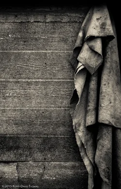
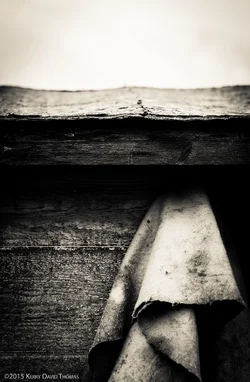
I looked at them all large...#1 for me. Why? I like the harmony of the single depth plane that it shows. The background/foreground relationship in #2 was not appealing to me--it put me off. Same with #3, with the roof and sky areas also making me feel...not engaged--I think because the white upper area shows no real detail, and it brings in another depth plane in a not-appealing way. For me at least the top area is just not advancing the shot, so I greatly prefer shot #1 for its simplicity, unity of feeling, and its self-reinforcing, single-plane vibe. #1 to me is also a wonderfully balanced, virtually perfect composition.





![[No title]](/data/xfmg/thumbnail/37/37136-40f690dc7da693c09d7c99c3782954b8.jpg?1734169835)


![[No title]](/data/xfmg/thumbnail/35/35665-6506470fd930bd101375a007d572615a.jpg?1734167295)
![[No title]](/data/xfmg/thumbnail/33/33341-3a6934b6cdb015b5acf31087acdcd278.jpg?1734163236)
![[No title]](/data/xfmg/thumbnail/31/31739-79afec4abf40a7270ab73b65a6bbf108.jpg?1734160457)
![[No title]](/data/xfmg/thumbnail/32/32172-e383665a8becbae2d9a6b61359dae22e.jpg?1734161047)

![[No title]](/data/xfmg/thumbnail/32/32169-37e80837cd927f85261d4e03344eef0d.jpg?1734161046)
![[No title]](/data/xfmg/thumbnail/32/32170-3fce4409fbea1f5e9818209c7e87c1ea.jpg?1734161046)