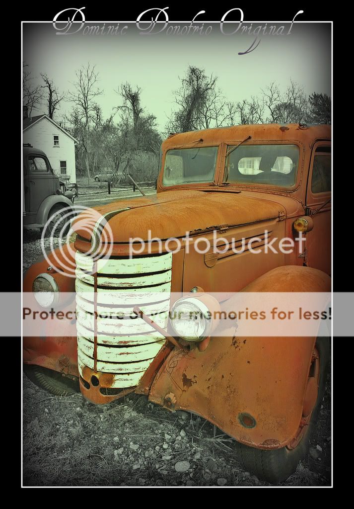
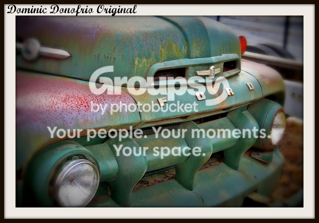
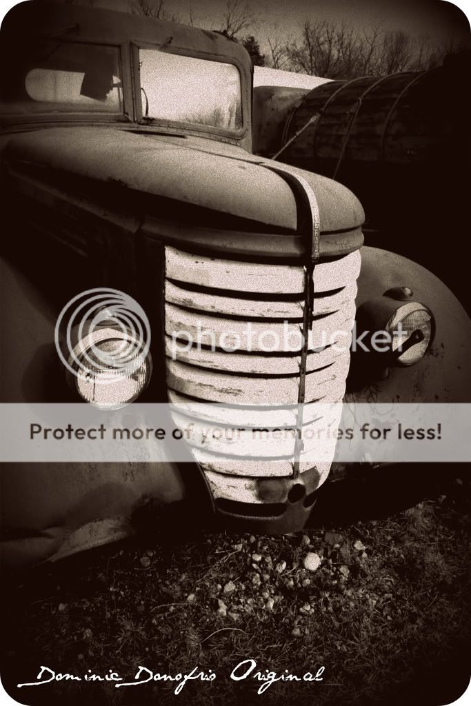
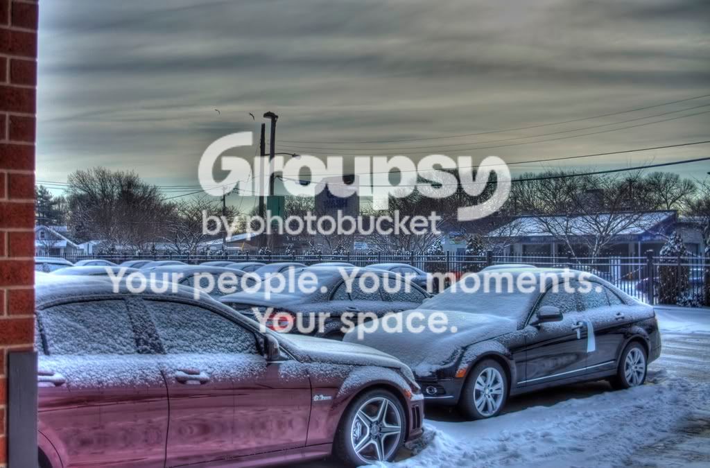
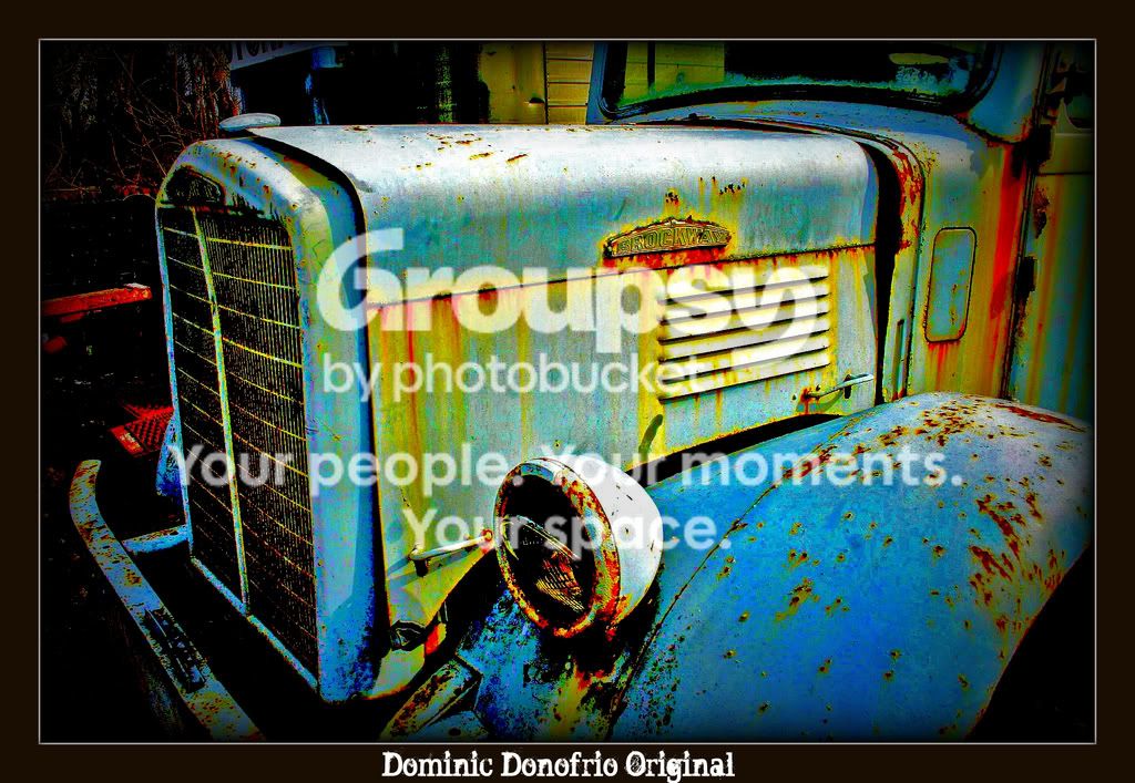
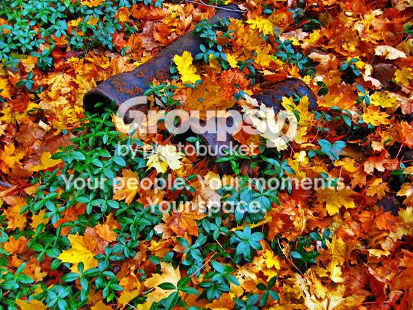
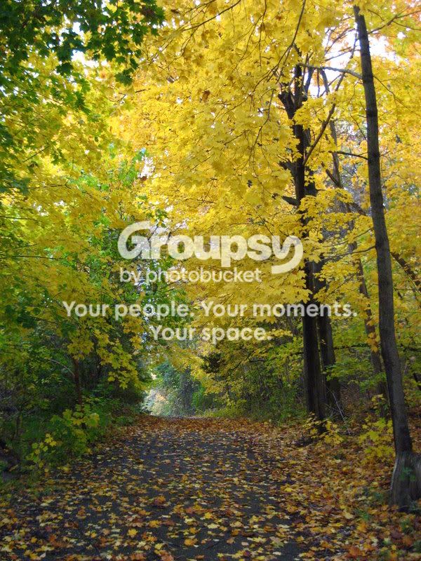
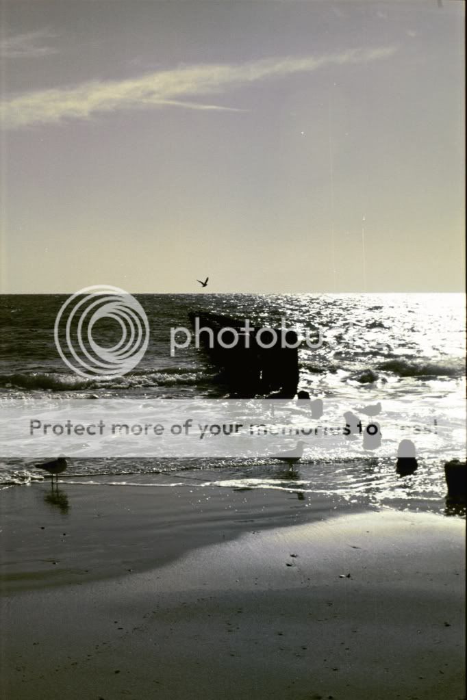
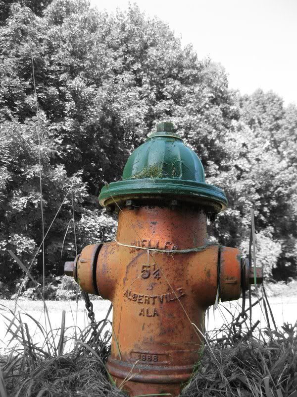
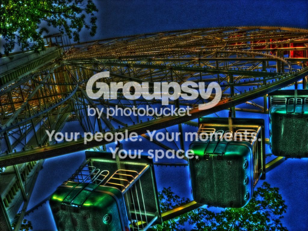
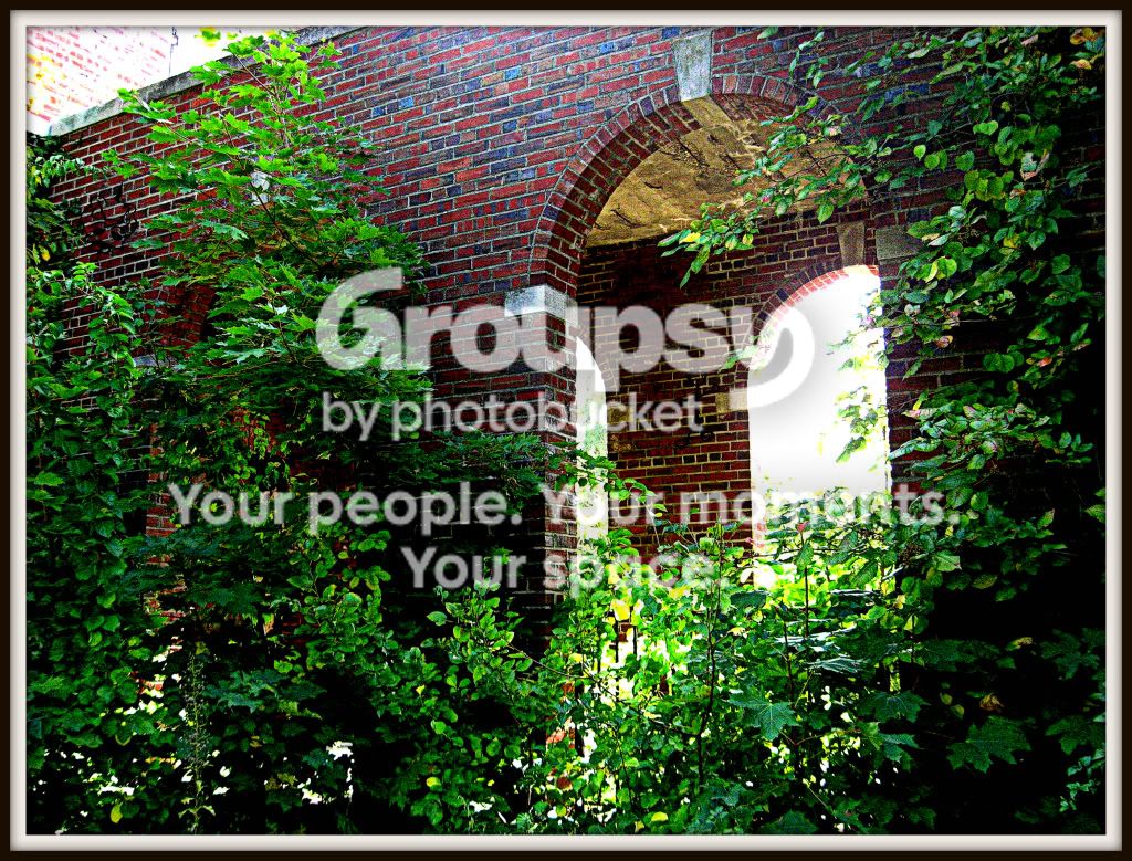
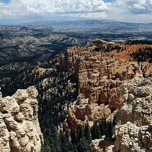
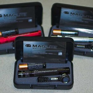
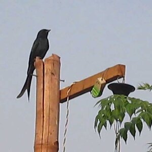
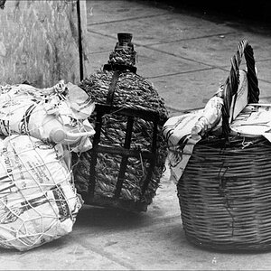
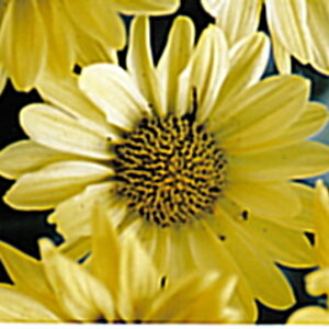
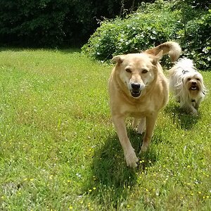
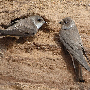
I really like the first two - they are very appealing. The second is my favorite of the lot. The next two don't do a lot for me....on their own they are nice enough, but I like the first two much more. The very last one (leaves) would be nice as part of a series, but on its own, does not contain enough information.
The second to last is nice in an artsy sense (love the composition) and I have a feeling that a lot of (youngish, male-ish) people might like that image in a poster or some such, but I personally would prefer something more subtle. I'm going to suggest that I'm just not the target audience for it rather than conclude that the processing is overdone.