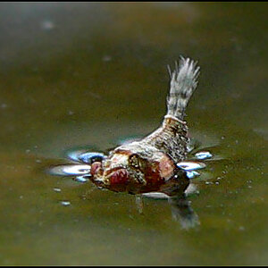
The picture is good, but I'm missing some contrast. it's too mid-tone IMO.
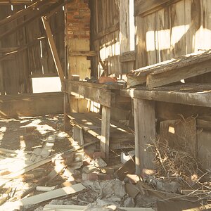
I would try to rise the whites lower the blacks and play with some contrast and clarity
Thanks everyone. I used the Velvia/Vivid Fuji profile in lightroom. It tends to oversaturate a bit. I am going to clone power lines out at some point also.
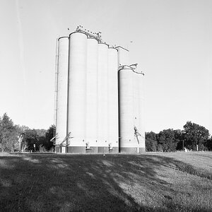
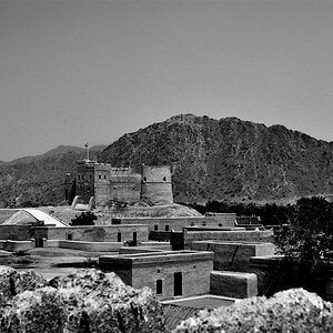
I liked it in B&W, although I agree about the contrast. For me it's about tonal contrast and texture and that little piece of red roof is distracting. You could darken the blues in the conversion to maximize contrast in the metal roof.



![[No title]](/data/xfmg/thumbnail/41/41756-e54235f9fba04c8380cd991845bb84b1.jpg?1734176055)
![[No title]](/data/xfmg/thumbnail/41/41757-2c3d7911242848ab00e3e9aaafa24381.jpg?1734176060)
![[No title]](/data/xfmg/thumbnail/37/37136-40f690dc7da693c09d7c99c3782954b8.jpg?1734169835)
![[No title]](/data/xfmg/thumbnail/39/39645-11fae384f9fd2ec2813acc42adec0206.jpg?1734173952)