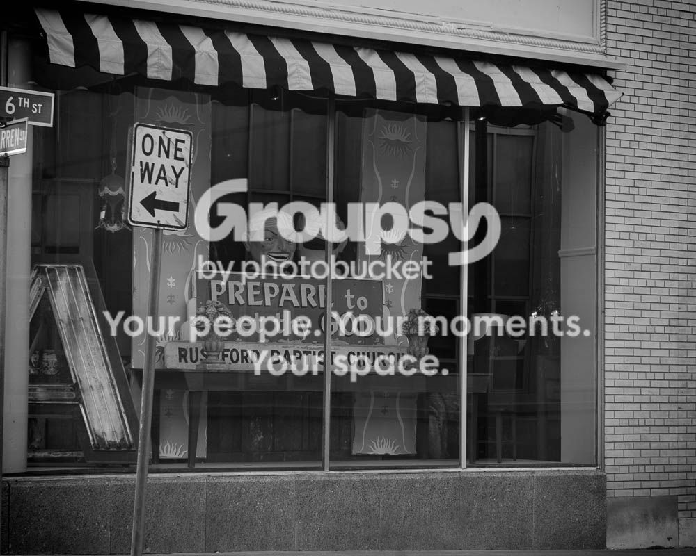
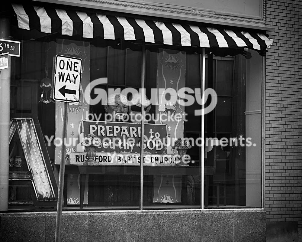
I agree that it looks a little dull and dark, and I am not seeing why it should be that way.
Also, I don't think the bricks on the right add anything.
I could see going for a low contrast look to underscore the shabbily banal feeling, but I think this is more successful if you push the whole thing up to brighter tones. Lose the blacks rather than the whites. This might be just be tradition or even a couple images I saw one time dictating my taste here, though.







![[No title]](/data/xfmg/thumbnail/42/42025-fa343f816d0cedc45447aa0b300e301e.jpg?1734176408)

![[No title]](/data/xfmg/thumbnail/42/42277-63576745f84be96df79b94ca0f49e00b.jpg?1734176687)



![[No title]](/data/xfmg/thumbnail/41/41926-7b67b67ec3a4ea78149adc9ca76efe76.jpg?1734176285)
![[No title]](/data/xfmg/thumbnail/41/41930-3f8741ecabbbfd4d67ade3e339078814.jpg?1734176287)