What's new

Opinions!

Haya.H

TPF Noob!
Joined
May 22, 2012
Messages
308
Reaction score
40
Can others edit my Photos
Photos OK to edit
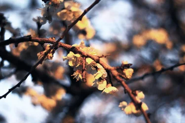
I cant decide what it is about this flower picture that i dont like, or what is wrong with it.
$Flower.webp$Palm trees.webp
 
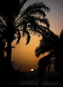
The 1st picture has no well defined subject. There are branches crossing in nearly every direction which just add to the confusion. Now your sunset is spectacular. Excellent composition, great use of the natural lighting, and is nicely exposed.
 
I was thinking the same thing about the flower one.. i guess i dont like it because its simply a bad picture haha. But thank you! i got lucky with that shot. i was in Aqaba in Jordan and as soon as i got there literally 15 mins after i entered Aqaba, my shutter broke. So it was a pure luck i even got that picture.
 
i agree with the others, the first one isnt that great of a shot but the second one is amazing
 
Haya, the flower picture has a number of flaws. Among them, the flowers are not in sharp focus, the WB looks off, the background is both too bright in places, and distracting, there is no main subject that captures your attention. The sunset picture, by contrast is the exact opposite - The sun AND foreground trees in sharp focus, the exposure is excellent, the WB is suitable to the image, the overall composition is clean and simple. Tell me that your 5-year old sister took the flower picture, and you put it here to test us. ;)
 
Haya, the flower picture has a number of flaws. Among them, the flowers are not in sharp focus, the WB looks off, the background is both too bright in places, and distracting, there is no main subject that captures your attention. The sunset picture, by contrast is the exact opposite - The sun AND foreground trees in sharp focus, the exposure is excellent, the WB is suitable to the image, the overall composition is clean and simple. Tell me that your 5-year old sister took the flower picture, and you put it here to test us. ;)

you got me. that was deff the case here. ;)

hahaha but thank you guys :)
 
I agree with the others that #1 is confusing.
I disagree about the second.
It has two centers of interest, both at the edges, with no relationship and not really much connection.
The foreground, which could add some supporting interest, is underexposed.

You will get better and more useful help if you allow editing for your pictures.

Lew

palmtreesllwitharrows.jpg
 
I agree with the others that #1 is confusing.
I disagree about the second.
It has two centers of interest, both at the edges, with no relationship and not really much connection.
The foreground, which could add some supporting interest, is underexposed.

You will get better and more useful help if you allow editing for your pictures.

Lew

palmtreesllwitharrows.jpg


What do you suggest about i do with the picture? or do you think its a hopeless case? lol
 
One center need to be subordinated.
In this case, I think the sun will always attract attention so clip off the palm a bit (and move it), then fix the colors a bit.

A little over-dramatic but a bit tighter I think.
You need to decide what you want to be important when you take the picture and arrange the otehr stuff to fit.

palmtreeslgllllllllllll.jpg
 
First image has the problem that the diffused background has nearly the same subject as that in the foreground and the former tries to dominate; the unwanted twig also adds to the dismay....I think the image would have been 50% saved, if this crossing flowerless branch was not there....

I liked the second image well if did not look at it through the specs The_Traveler is!!! His analysis is very critical :D

Regards :D
 
Lew, I respect your skills and opinion, but I will have to disagree with you on this image. You've identified the base of the palm on the left as a visual center, with the sun being the other center. I don't see it that way, and my eye starts at the sun and travels upwards towards the palm fronds joining together at the top of the image, and finally reaching the bluish tints at the very top. The portrait orientation works for me, encouraging us to see in a vertical direction. The lack of detail in ther foreground also works for me in that it focuses my attention on the sun, the graduated colour change in the sky above it, and finally, ornamentation of the fronds in silhouette. The version you created looks less attractive to me, with the sun appearing to be trapped in a small pool of light, surrounded by spiky things. In the original, I see the fronds as light while in your version they appear "heavy". I also don't see the foreground, being more visible, adding to the image.


Guess this just goes to show that each viewer brings their own perceptions to the party.
 

Create an account or login to comment

You must be a member in order to leave a comment

Create account

Create an account on our community. It's easy!

Log in

Already have an account? Log in here.

New Topics
Back
Top Bottom