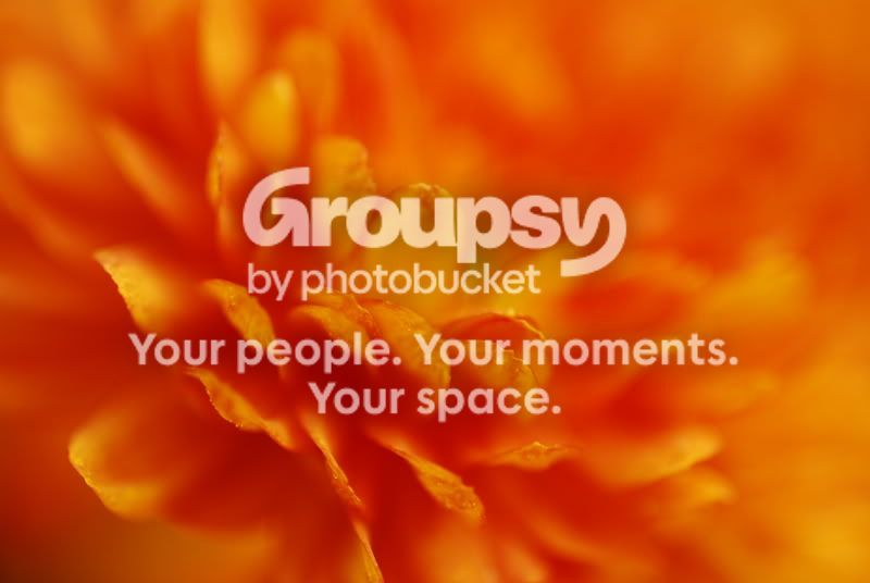
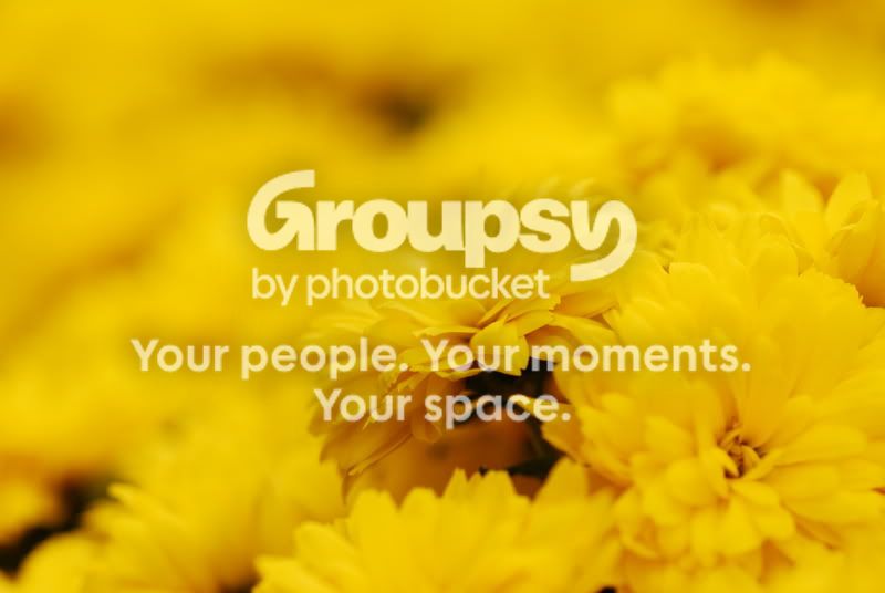
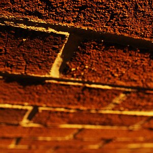
I like the first one better. The second one is just too yellow. But somehow the first one isn't too orange. I guess it's just 'cause I like orange better. :]
Craig: I actually did not touch these photos PP...I may play with the yellow one but I like the orange just the way it is! I liked the really shallow depth of field and the continuity of color because it gives only a tiny hint of what I was photographing. It was exactly what I was going after.

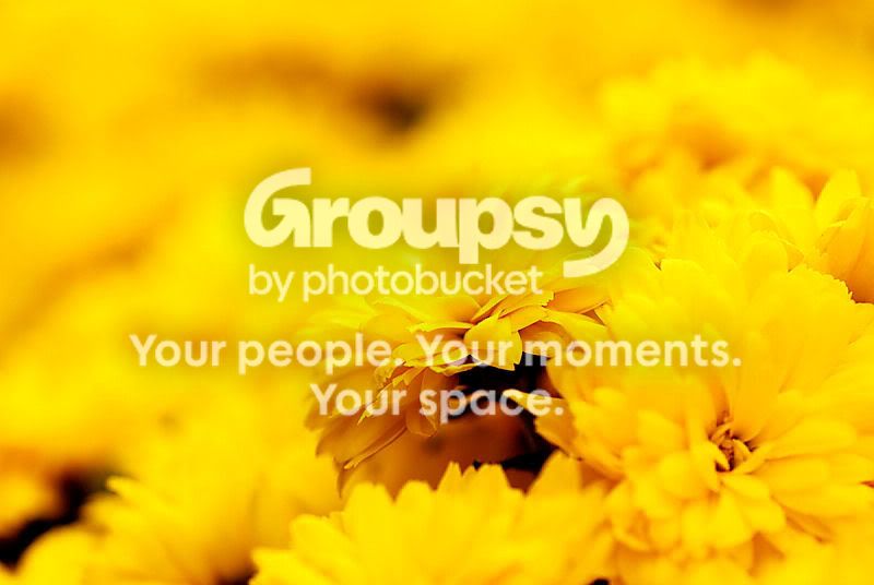
Ok...so here is the yellow again. Boosted the contrast a bit and sharpened it a touch. I like it much better now. The orange shot, I like untouched. Your thoughts?
I like the edit. Like I say it is up to you. I personally have trouble working in just one colour. I tried an edit on your photo and there was no detail in the blue channel. I think it would take a reshoot to get better tonal range. What was the colour temp you used. How did you get the yellow and orange colour cast?
I shot using available light in a conservatory, shooting in a preset WB mode of either shade or cloudy. It was in an area that was inundated with mums of both colors. How would you get a better tonal range of something that is so...well...yellow? They were very, very yellow.