Pacific Art League

tecboy

No longer a newbie, moving up!
Joined
Feb 17, 2012
Messages
2,977
Reaction score
358
Location
San Jose, Cali, The Heart of Silicon Valley
Can others edit my Photos
Photos OK to edit
C&C Welcome!!!!

1 _MG_0107.jpg

2 _MG_0140.jpg

3 _MG_0152.jpg

4 _MG_0160.jpg

5 _MG_0168.jpg

6 _MG_0173.jpg

7 _MG_0193.jpg

8 _MG_0204.jpg

9 _MG_0291.jpg

10 _MG_0293.jpg

11 _MG_0304.jpg

12 _MG_0317.jpg

13 _MG_0321.jpg
 
There is a lot of pics here so its hard to comment on everything. In general you might want to read up on composition and it might help if you ask yourself when shooting something what it is that you want to show, what caught your eye that you like and then compose the rest around that so to speak. Your photos here are unclear in that way to me, I do not know what my eye is supposed to be drawn to or what moment thats special somehow I am supposed to get.
 
#4 is interesting in the way the little girl is looking at YOUR camera, while her mother looks at the photographer taking the photo of the two of them! I think candid shots of this type are difficult to do.
 
There is a lot of pics here so its hard to comment on everything. In general you might want to read up on composition and it might help if you ask yourself when shooting something what it is that you want to show, what caught your eye that you like and then compose the rest around that so to speak. Your photos here are unclear in that way to me, I do not know what my eye is supposed to be drawn to or what moment thats special somehow I am supposed to get.

Pick a least one or 2 images which you like the most or need improvement and then critique.
 
They are candids. Not sure what to comment on. Exposure looks good, focus seems good, framing good enough anyway for candids. I prefer the ones without the painting cut off in the backgrounds. The white balance does seem off. I imagine that wall is supposed to be white, or close to white. And i see the walls tinting and what seems the colors a little amiss in a couple of those.
 
think i like five the best.
 
I'm trying to tell a story. It is an art gallery with people inside and interact. It is a nonprofit organization trying to use these photos for social media.
 
actually i like six too. The donkey over her shoulder. people in the background. just seems like a cool shot. Nice stuff on the wall to look at. Again here, the wall is a little tinted pinkish. Not as bad as a couple of the other ones though. Think you might want to just go through and do a white balance check. Lighting could be throwing it off.
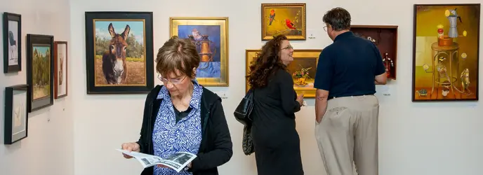
 
actually i like six too. The donkey over her shoulder. people in the background. just seems like a cool shot. Nice stuff on the wall to look at. Again here, the wall is a little tinted pinkish. Not as bad as a couple of the other ones though. Think you might want to just go through and do a white balance check. Lighting could be throwing it off.

I dunno. The little yellow cast is from the multiple lights underneath the ceiling. The lights are not uniform.

This image looks kinda of dull.
_MG_0173.jpg
 
actually i like six too. The donkey over her shoulder. people in the background. just seems like a cool shot. Nice stuff on the wall to look at. Again here, the wall is a little tinted pinkish. Not as bad as a couple of the other ones though. Think you might want to just go through and do a white balance check. Lighting could be throwing it off.

I dunno. The little yellow cast is from the multiple lights underneath the ceiling. The lights are not uniform.

This image looks kinda of dull.
View attachment 96750
yeah. Other one looked better. I get the under ceiling lighting but seemed to have another tint going. 7 shows the difference between with and without the lighting. 9 is a good representation of the lighting on the wall. Maybe you just upped the saturation and moved up the warmth slider in some others and that is how they came out. Same thing would happen in number four if you corrected that. I could be wrong, but that doesn't just look like the lighting from under ceiling to me it has a different cast. Maybe the walls are better off not being white in this case though. hey, two cents.

If these are being shown side by side though, i would try to find a wb and stick with it so they all look uniform.
 
Last edited:
nice job btw. Don't think i am trying to slam your photos i just noticed the tint change.
 
I also like the one with the other photographer and the kid.
#1 and #2 are sort pre-opening shots, I don't think I would include those on the site but would show them to the people in the photos if they work or volunteer there.

#12 and #13 are the same group of people so I would pick one or the other, I would go with #12.
I'm sure on social media with names added the participants and their friends would like the photos.

I do not like to crop to different aspect ratios in one series of photos.
I often try and avoid pictures direct on of someones artwork where it could be seen as the main subject unless it is specifically to promote their work such as part of the gallery contract.
 

Most reactions

Back
Top