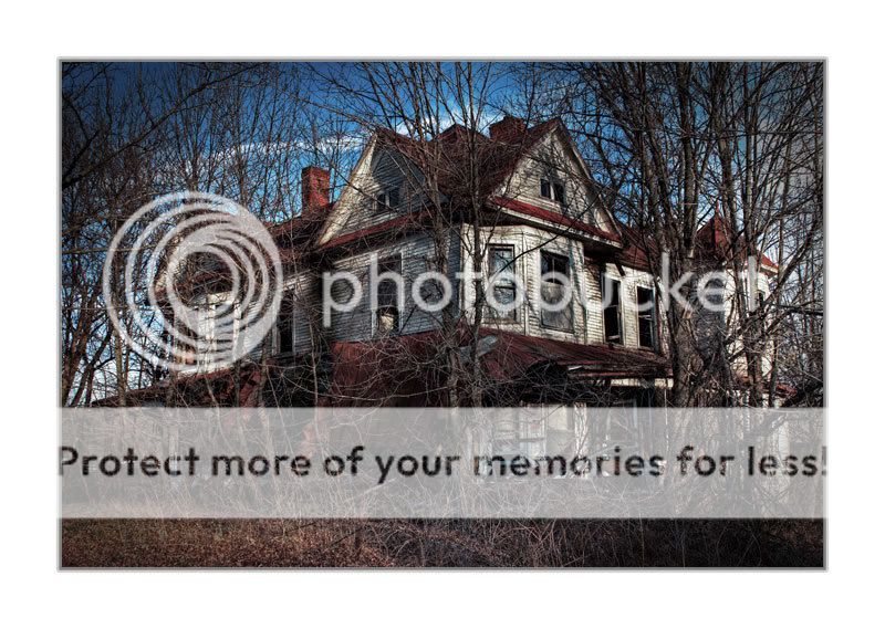
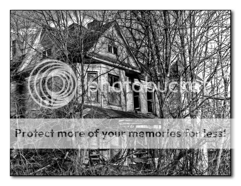
I really appreciate the comments so far. Each of these are favorites of mine for different reasons. The first, I just like the decay, rot, abandoned feel of it. I actually prefer another crop in B/W I did of it:
but when I got it printed they monkied with the tones a little and I didn't like it as much.
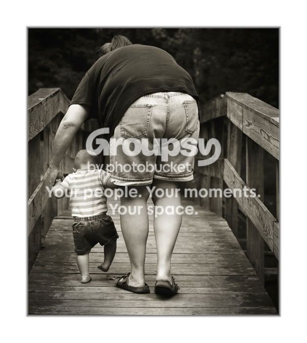
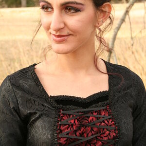
#2 is a very dear picture to me, and it probably won't even place actually b/c it seems like competitions steer away from pictures that don't really have much of a value to anyone beyond the photographer or the subjects. I still really love it for the obvious reasons of it having my wife and daughter as the subjects. I also like the tones in the print.
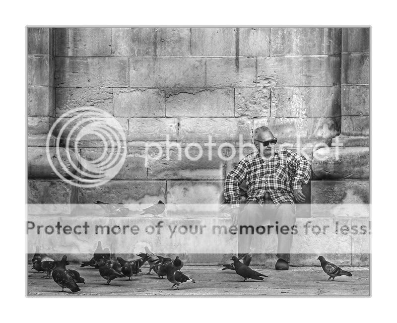
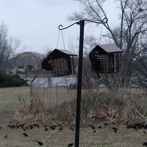
#3 is my favorite "artsy" type of picture, and I feel it has more appeal to a larger audience. I'm not sure I really nailed the tones, but I like the picture overall very much.
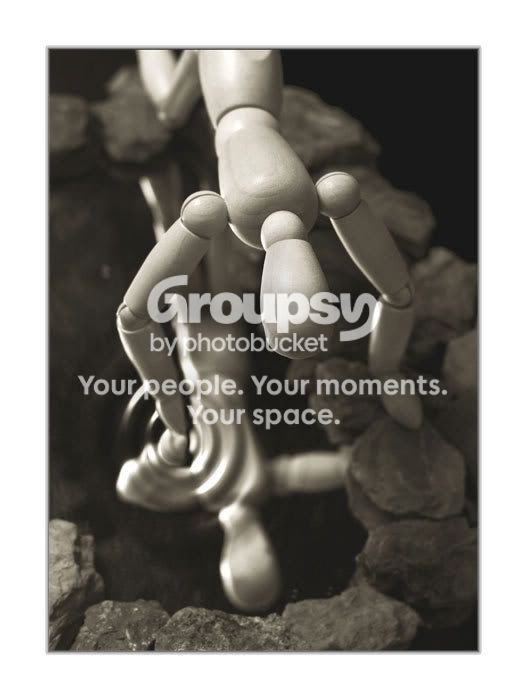
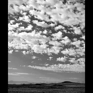
#4 is just kind of neat to me. I am throwing it in, b/c it seems like these competitions like still life kind of photography. I doubt it's an award winner, but I thought I'd throw in a little from different areas hoping something might appeal to the judges (shotgun approach).
I completely agree with the assessments already noted here. Any others?







![[No title]](/data/xfmg/thumbnail/37/37170-3e18af574ed51cce5bdf99af9d3cab40.jpg?1734169892)

![[No title]](/data/xfmg/thumbnail/42/42329-331b54ea6493a8cdd21d8e624fe97e85.jpg?1734176827)