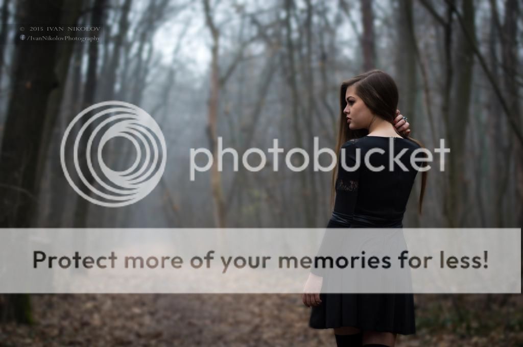
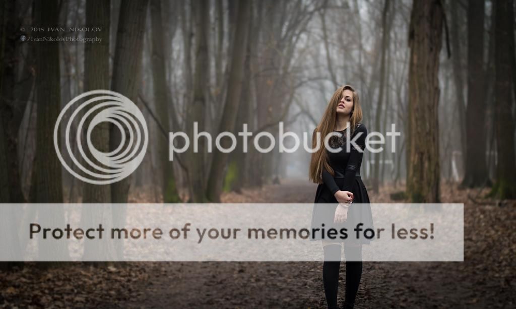
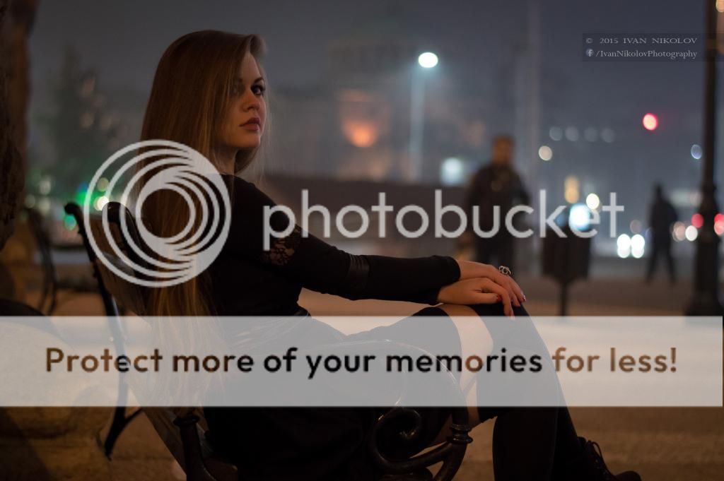
I agree you might need to take a look at the brightness/contrast in some of them. In a couple of them it would have helped to arrange the hair a little more to not have some strands or a hank of hair hanging in a rather awkward way (#1, 5&6).
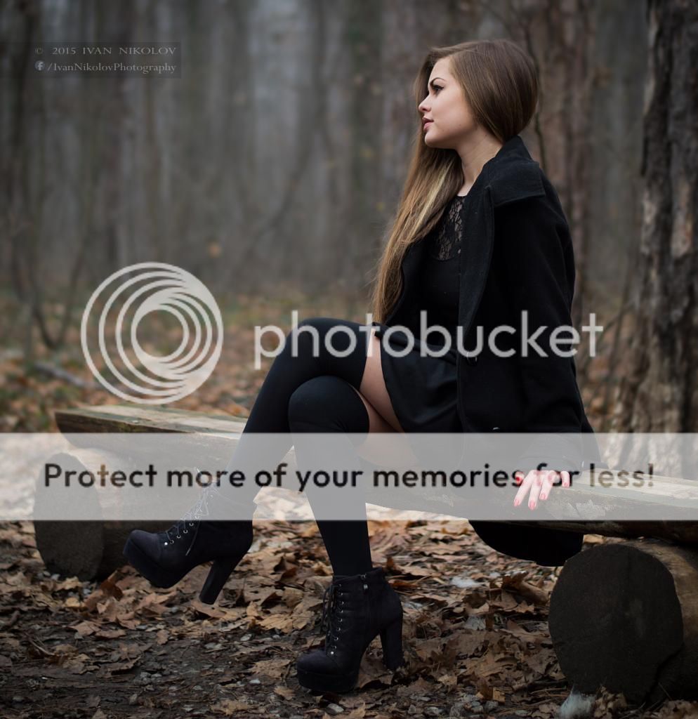
I'd think about the framing, in at least a couple of them her foot/shoe is cut off, in one it's her fingertips (seems to be the bottom of the frame you need to watch, seems to be enough space above the head).
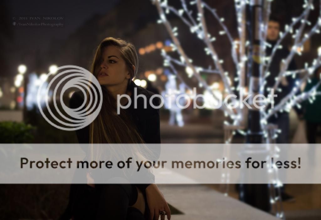
If you're out somewhere I'd keep an eye on backgrounds and passersby; with #7 it might have been better to wait til the guy standing there moved on; also the lightpost looks crooked, probably the perspective but do you want it in the picture or out of the frame?
edit - I think it's the details, I like the idea of the mood you're creating. I like the ones with the with lights, and those look better on your page than on here so maybe the quality of what we're looking at here isn't as good.
") How can I improve or what to fix, next time?
How can I improve or what to fix, next time?


![[No title]](/data/xfmg/thumbnail/42/42015-c5cdef195e2aab7b272f0c03437c42c4.jpg?1734176396)


![[No title]](/data/xfmg/thumbnail/35/35965-cac1057a7f2dd8e8aeeefed50ae8c080.jpg?1734167827)