Portraits in High-Wind and Little Light... Comments and Critiques?

D-B-J

Been spending a lot of time on here!
Joined
Apr 13, 2010
Messages
9,027
Reaction score
2,175
Can others edit my Photos
Photos OK to edit
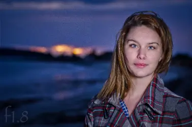
One from tonights quick session. I ran out of light far too quickly, we were contending with strong wind, but I liked the way this one came out. Lit with one SB600 camera right with a small(8 or 10 inch) beautydish. Shot using a D7000, 50mm 1.8D, pocketwizards, SU800, and the SB600. I found myself limited to one light as I was afraid to use umbrella's in the strong wind... I do have stand-weights, but I feared they wouldn't be heavy enough. Haha. Flash was around 1/4 power, and maybe 2-3 ft away from subject.


Windswept at Sunset by f_one_eight, on Flickr

Regards,
Jake
 
Flash was way to bright. She's pretty washed out here. This would have been a good time for an assistant.
 
If you just had one light, why did you put it dead center?

I would move the colors around on her jacket a little. Push a little orange into the reds and a little blue into the greys.

I quite like it, despite what I mentioned above.
 
Flash was way to bright. She's pretty washed out here. This would have been a good time for an assistant.

I thought the same thing. I imported a big version of it into Lightroom, and tweaked the brightness, fill light, color, saturation, white balance and tint, and made a version of the way I might have processed it. Here's my quick re-work on it. The thing I tried to capture was a good balance--to be able to see her well, but also to see some of the orange sun rays as they reflect on the water, just off to the left side of her hair and shoulder area. In Nikon-speak, your shot might be considered to look as if it were made with TTL flash metering, whereas in my re-work of your photo, I tried to emulate the look of what Nikon calls TTL-BL, or TTL Balanced Lighting, which is sloooow shutter speed scenarios, cuts the flash output way down, and brings the flash exposure close to the level of the ambient light exposure.
 
Hmmm, the light wasn't dead center... I do see how it may be a touch bright though.

Thanks for the edit Derrel!

Jake
 
Any more thoughts??

Jake
 
Hmmm, the light wasn't dead center... I do see how it may be a touch bright though.

Jake

How far to camera right was the beauty dish? It certainly looks like it's close to on-axis, because there is only a hint of shadow on the left side of her nose and face. So in my opinion it was either too close to her, or not far enough to the right.

It's all subjective of course, there's not necessarily any "correct" way to light your subject - it all depends on what you're trying to accomplish. To my eye though, the dark, moody background (which is nicely exposed btw) just begs for more contrast on the subject. It would look a little more like the lighting belongs there instead of saying, "Hello, I'm a flash!"

It was probably too close... I was just so rushed, haha.

Jake
 
Always look for the catchlight!

You can see that it's not quite on-axis if you look close. I admit that I just glanced at the catchlight and misread it as centered without checking the shadows too closely. It is up and camera-right a bit. I think this is pretty close to, um, Terry Rishardson's look, perhaps? I think it's flattering to skin texture, smoothing things out, but flattens the features out a fair bit. Or something like that. Derrel probably has some comments that are on target here.
 
If you just had one light, why did you put it dead center?

I would move the colors around on her jacket a little. Push a little orange into the reds and a little blue into the greys.

I quite like it, despite what I mentioned above.

Glad you like it! I think the beauty dish is just too small for anything useful... Or as a single light. My assistant was stuck in class, sadly. Haha.

Jake


Sent from my iPhone using Tapatalk
 

Most reactions

Back
Top