What's new

Portraits of a friend

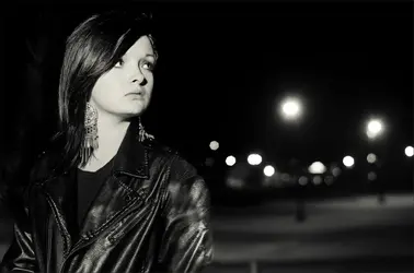
#4 is my favorite. Although I wish she was on the left of the image looking inwards instead of outwards.
 
$flipp.webp

Like so...
 
Nah, Man! I saw this portrait a little bit ago, Don't ask me which one, I forget, Where the subject was looking away from the center of the frame. It created a more interesting feel for me because it's the opposite of what you'd expect. So I went out and shot something like it, Thanks for the edit though
 
I see Runnah beat me to it... but he didn't feel in the arm / shoulder area....

$based.webp
 
Last edited:
Normally I'd agree with Runnah and Charlie, but in this particular case your original image is working better for me. I have to figure out why (because it looks like an exception to the rule), but it may have something to do with the expression on her face and the personality that's coming across. There is sadness and resignation in her eyes, and she appears (to me anyway) as a rebel/nonconformist of sorts. Given that, looking at the end of the frame works better because it's almost like: I don't care what happens here.

In general, I really see potential with her. Your model appears to be a very interesting subject with a strong personality. May be you could bring that out more? E.g., in her clothing...instead of black leather, may be ask her to put on something more indicative of her personality. Tattoos? I obviously don't know her, but I'm just expressing what I'm feeling. IMO good portraits always reveal the personality.
 
I like #1 because of the repeated textures of earrings, hair, and tree branches and also I like photographs with a lot of darkness in them. Where'd her lip stud go, though? Did you flip this one?

#2 and #3 do pretty much nothing for me.

#4 is excellent as-is. Looking out of the frame gives a sense of the unknown, a little fearfulness. What's she so worried about? This fits with the rest of the scene, I think. When she's looking in to the frame it just looks like a posed portrait with room left for a bunch of ad copy. More formally correct, perhaps, but a much less interesting feeling.
 
Thanks for all the replies, guys. I love the mixed opinions on the direction she's looking, I'm still digging my original photo more than the edits though. I like the idea of her being rebellious and non conformist and all that, next time I work with her I'll be sure to coordinate everything accordingly.
And for whoever asked about the lip ring, I wasn't feeling it in that picture so I just shopped it out, I never flip pictures. Especially portraits, I didn't even think anyone would notice haha.
 
#1 has stuff growing out of her head.
#2 could have been good but it is too tightly cropped.
#3 could have been but the object to the left is very distracting
#4 I like it just the way it is. It says (I'M OUT OF HERE! to me lol) Breaking the rules can be fun.
 
Last edited:

Most reactions

New Topics

Back
Top Bottom