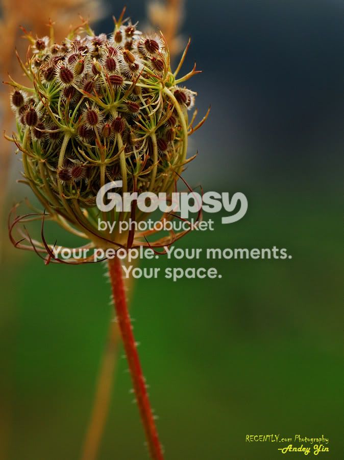
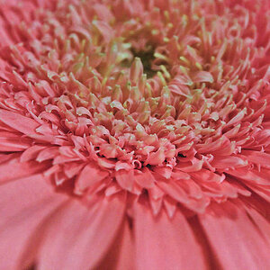
Nice subject - as busy as it is, it doesn't look too busy due to geometry and background. Good background. Good focus and selection of DOF. Subject scale is good, however, you are having cropping problems again IMHO. Would like to see a little less space at lower right and subject moved to right and down a bit - the stem should come into the bottom to the right of center to balance the image and I would place the top "crown" at the 1/3rd down point. Vertical cropping is ok here but you might just change the aspect ratio (less vert - cut off more bottom) and that may fix it up some? The subject has a lot of mid-tones giving it a slightly flat look - would have like to see the top "crown" slightly spot-lighted at the sacrifice of the bottom of subject "sphere" (don't think I made myself clear on that point but was the best I could do

.





![[No title]](/data/xfmg/thumbnail/38/38262-10a9668da9a2b36a92cddde57caf87bc.jpg?1734172150)