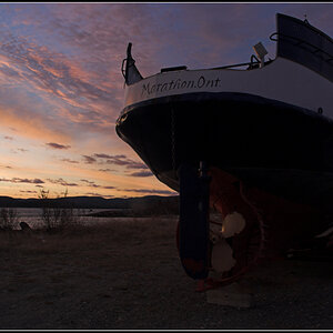
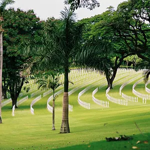
This is a neat image, I like the different layers. However the blown out sky kills it for me. I would try and bring some of the sky out with your levels. And maybe try to bring the blue out in the foreground plants.
This is a neat image, I like the different layers. However the blown out sky kills it for me. I would try and bring some of the sky out with your levels. And maybe try to bring the blue out in the foreground plants.
I really like the layered colors, but the sky is the least attractive and important element in your composition. I would consider a re-crop and remove at least 1/2 of the sky.
I like the 2nd edit you did. I think what you did to the sky helped the image a lot. I think Joel_W's suggestion is worth a try as well. I just scrolled using the top of my screed to crop it a little above the tree line on the left and it does seem to bring more attention to the foreground. I think you could use it both ways.
I really like the layered colors, but the sky is the least attractive and important element in your composition. I would consider a re-crop and remove at least 1/2 of the sky.
I like the 2nd edit you did. I think what you did to the sky helped the image a lot. I think Joel_W's suggestion is worth a try as well. I just scrolled using the top of my screed to crop it a little above the tree line on the left and it does seem to bring more attention to the foreground. I think you could use it both ways.
Thanks Scuba. I've cut away some of the sky (reply to Joel). Not quite as much as you suggested, but I think it makes a difference whilst keeping enough of what, for me, is an important part of the photo.
I like the composition best in the last version. But the sky is awfully grainy. High ISO? Noise reduction? How was your camera set? The color balance seems a bit off, too, imo, though that could just be my eyes at this time of night.
I like the composition best in the last version. But the sky is awfully grainy. High ISO? Noise reduction? How was your camera set? The color balance seems a bit off, too, imo, though that could just be my eyes at this time of night.
Yes, the grain is due to the PSE8 work I did to bring the sky out a bit, but on paper this isn't so noticeable (that's why I softened it a bit - to reduce the grain for printing). The colours have been very slightly saturated in Picasa, to bring the yellows and greens up a bit, but maybe I should have left that. Otherwise, to answer your questions, this was taken with a circa 50 year old Voigtländer Vitomatic 1a using Ektar 100 film and a Gossen Sixtar light meter. Thanks for your thoughts.