What's new

Recent Product Shots. *Bling*

Bitter Jeweler

Been spending a lot of time on here!
Joined
Apr 27, 2009
Messages
12,983
Reaction score
5,003
Location
Cleveland, Ohio
Can others edit my Photos
Photos OK to edit
I can't wait till my shop expansion is finished so I will have a dedicated photography area.
These are still making do, flying by the seat of my pants...


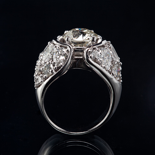
I can't believe I missed focus on this one. *gah*

1.
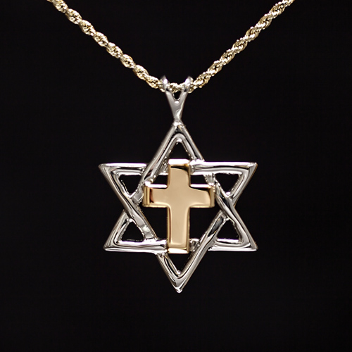
5851234069_4050bb12f2_o.jpg


You can see the beginning of making this beast here: http://www.thephotoforum.com/forum/just-fun/246331-cluster.html

2.
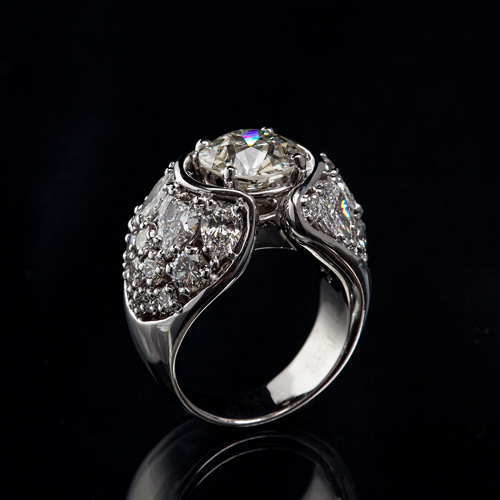
5851230759_2b8bfe5cc9_o.jpg


3.
5851230655_4aa3bd9c4d_o.jpg


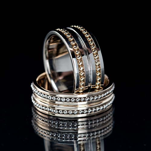
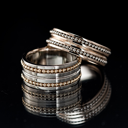
Which do you like better?

A.
5851232527_55f4e81812_o.jpg


B.
5851783734_3770879d29_o.jpg


Each bead was made by cutting off equal lengths of wire, and melting them into balls.
Each bead is laser welded, one at a time, to the ring base, looking through a low power microscope.
 
My vote goes to #3. These are awesome shoots. Looking at your name and the descriptions you do this for a living?
 
You didn't miss focus. You "focused less than optimally!" Zzzzowie, those micro ball-bearing type rings are gorgeous!!! My goodness, that sounds like a lot of work is required to make those balls, but the results are simply unlike anything I've ever seen before in the jewelry arts. Just simply lovely!

On the photography aspect, I think my favorite photo is A. To me, the dual reflections in the black background on B creates a bit too much distraction for my eye to feel comfortable. In photo A, the ring on top is upright, and fills up a lot of the space, and the ring on its side forms a "base" for the upper ring, so to me A is the more dynamic, pleasing composition.
 
Hmm, I like the arrangement of photo B much better. The stacking in A looks much less natural. And I like that you can see the whole reflection in photo B. Where as the reflection on photo A leads you out of the frame.

I dont believe the reflection adds to either of these images though. I would like to see layout B shot on black velvet.

Edit: wtf is going on with that first piece? Jews for Jesus or what?
 
Amazing work bitter, im diggin B.
 
Nice! Not sure if the spectrum helps or hurts the photo.
 
Initially I was thinking I liked B more, but as I looked at it the reflections made my head hurt, so my vote is for A.
 
If I were shopping for jewellery, I would prefer to see the item without any reflection (as in photo 1) but, as a photograph I like the reflections in A and B. The ring with the beads is beautiful :thumbup:
 
Nice workmanship.

#1 is very interesting piece with the Star of David and the Crucifix - I've always loved the message of that.

I like the overall shot and composition of A although I can see a reflection on the ring itself...seems like a hand? The ring sells itself in A where the abstract of lines and reflections make a great photograph in B. But I can totally see A in a catalogue.

Man I wish you were local here in Cali so I can check out your work.
 

Create an account or login to comment

You must be a member in order to leave a comment

Create account

Create an account on our community. It's easy!

Log in

Already have an account? Log in here.

New Topics

Back
Top Bottom