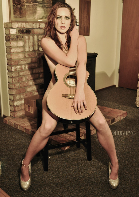
#1 is a pretty good idea, badly handled. I like that her skin tones and the guitar are so similar. I dislike that the same narrow tonal palette is used for everything else, and also the location looks cheesy. It's obviously just someone's den. If you're going to do "casual, vernacular settings" don't strive for the fashionish look, it's not going to read well.
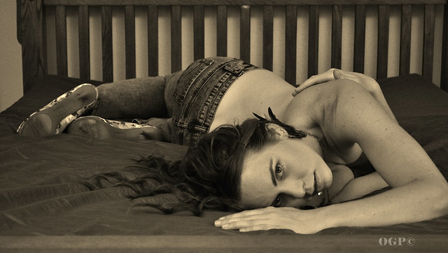
#2 is potentially excellent. Wonderful pose, really really good. Add some better light, and think about the bedspread a bit more (either smooth it or rumple it, this middle area just looks careless and casual; also consider colors/tones more carefully), and you've really got something good.



![[No title]](/data/xfmg/thumbnail/41/41423-156eb6e5a056cd1cbcf60e12a03f9d56.jpg?1734175857)

![[No title]](/data/xfmg/thumbnail/36/36657-3774cdd7ebbafa5ccac2741386b9949a.jpg?1734169171)