Redo on Red Poppy on Yellow

cgipson1

TPF Noob!
Joined
Aug 18, 2011
Messages
17,142
Reaction score
4,350
Can others edit my Photos
Photos NOT OK to edit
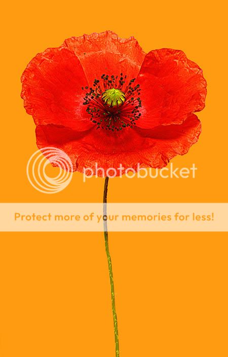
I did some PM'ing with several members of TPF... and followed some suggestions about PP on the image I shot yesterday as a test image. I like this one much better, much more detail, and I think it is better balanced. Still lots of yellow, which some people don't care for.. but look at the Poppy, not the background... let me know what you think.

Link to the other if anyone wants to see the previous image: http://www.thephotoforum.com/forum/nature-wildlife/291275-red-poppy-yellow.html#post2648815
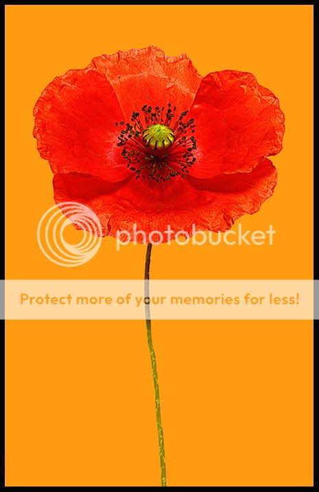
New image:

7578390248_71c1c0c528_b.jpg

Red Poppy on Yellow by CGipson Photography, on Flickr
 
Last edited:
Very much a piece of art! Great work!
 
This is stunning. I like the redo better. The flower seems to stand out a little more.

Thank you.. I still have a lot to learn about Photoshop! lol! But with Derrel's suggestions on how to bring the flower out, Forkie's stem suggestion and several other who made comment.. it is hard to go wrong! :)
 
Love it. It's a Pop Art poster. Larger than life.

I did a really subtle nitpicky edit. Can you see what I did?
(no curves, or color adlustments)

7578390248_71c1c0c528_b1.jpg


I also, as it just really appeals to me, think a thin border really makes it pop...

7578390248_71c1c0c528_b1b.jpg
 
Love it. It's a Pop Art poster. Larger than life.

I did a really subtle nitpicky edit. Can you see what I did?
(no curves, or color adlustments)

7578390248_71c1c0c528_b1.jpg


I also, as it just really appeals to me, think a thin border really makes it pop...

7578390248_71c1c0c528_b1b.jpg

Yes.. I see what you did! Lol! You made it look more like the Adobe RGB image looks like on my system... the Srgb conversion took the life out of it. I did lighten some, and added some saturation.. but not enough. I like yours better! :) Details... please? Yes.. the border is nice too!
 
Oh, I didn't change colors or anything intentionally. Maybe the conversion did, but that wasn't what I wanted to show you.

Don't get me wrong, I love the original. What my detail oriented picky mind picked up was the flower was oh so slightly off center, and what really nagged me, was the stem was off center. So, what I did was to enlarge the canvas and sampled the background color to fill, then rotated it just a tad. I also then content aware stretched half of the stem to make the image a little taller.

I think this makes the poppy feel a little more, well, heroic?


That's something that bugs me with flower shots that are just the flower, with the stem cut right below the bloom. And you didn't do that here! In fact, I could see this as a very tall, narrow, image with even more of that delicate stem, and maybe even a leaf (if I remember correctly how they grow) in the middle of the stem....if you get what I mean.

Whatever you did made the shot much more vivid on here.... compare them, and you will see what I mean. I knew the flower was off center a small amount ( I had just eyeballed it)... so I appreciate your doing that! Your changes are indeed very subtle....and I will keep them in mind when I actually start on this project. Thanks for the tips! :)
 
Nice! I love that last edit bitter did with the black border. I could see lots of people wanting to buy a print of this. great job!!
 
Nice! I love that last edit bitter did with the black border. I could see lots of people wanting to buy a print of this. great job!!

Thanks Paige! I think I should hire Bitter as a consultant! lol! :)
 
I like this one as well. It is an excellent example of how simlplicity in imagery makes a fantastic picture. This is an excellent example for those just starting out on how simlplicity is the key to a great image. Look forward to seeing more of this genre.
_______________
WesternGuy
 

Most reactions

Back
Top