What's new

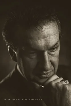
Retro style portrait ...

pellepiano

TPF Noob!
Joined
Dec 11, 2006
Messages
12
Reaction score
2
Location
Stockholm
writer_700.jpg
 
Very beautiful portrait. You seem to be channeling the master, Yousuf Karsh. And that's always a good thing. Excellent.
 
I do not like the placement of the eyes and face within the frame...too far to the right...

You could crop it tighter, some off the left edge, some off the top, and in that way make it a much better,more-balanced composition. His contemplative look, thoughtful hand position,and downward glance are ALL excellent, and well-intgrated. I just think the framing is "off". It is a wonderful "look" at the sitter. Perhaps a slight, and I mean very slight, bit of dodging on the shadowed eye and cheek might draw us in a bit deeper into his gaze?

It does have a retro feeling to it.

 
I tried a quick crop and dodging of some of the deeper shadow areas, and a slight burning in on his forehead...I like it a bit better, but if I had an original file, I think the cropping I'd want to have would be easier to obtain. Just for the heck of it, I made this a bit more warm-toned, like it had been printed on Agfa Brovira paper, to give it a 1960's "feel". I hope you do not mind this rework being posted; if so, please just say so or PM me and I will gladly remove this version.

$writer_700_sepia tone.webp
 
Thanks for the nice commants.
Yes the crop looks good on your version, good catch. I will keep the softness though as it looks good on paper also ( in my eyes ).
 

Create an account or login to comment

You must be a member in order to leave a comment

Create account

Create an account on our community. It's easy!

Log in

Already have an account? Log in here.

New Topics

Back
Top Bottom