- Joined
- Jul 14, 2011
- Messages
- 4,173
- Reaction score
- 2,551
- Can others edit my Photos
- Photos OK to edit
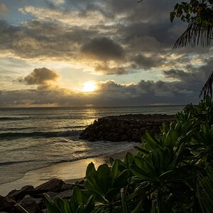
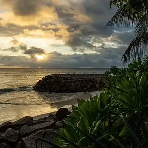
Nice image. Composition seems just right to me. I might try darkening the sky a bit.
Hello there! I've seen great shots from you lately, so I'll take that as a base to critique this one
The composition is 'correct'... You're somehow following the rule of thirds, include something in the foreground to give a sensation of depth and all... But the foreground on the left side is way too dark for my taste, most of it (foreground) is uninteresting and doesn't get the viewers attention for more than a second... Then, the sky is a little flat for my taste and the lights are a little blown or difused.
Anyway, it's a nice picture, but seeing your work lately, I think this one is not that good.
Have a nice day!
Regards,
LizardKing

Wow very nice image. I really like what I see.
Very cool....I really like it. I am more into the blue and black thing going on at the bottom for some reason. I like the shapes and shades of blue in the rocks and water. The lights at the top make me want a margarita on the beach on a warmish night....wait make it a mai tai. Very cool.
Yes, it's not easy to work with lights like these when you're doing long exposures... This is just personal 'feeling', but it seems the humidity in the air plays an important role in how the lights are exposed... To me, I like to take this kind of shots after it rains. One of these days I'll upload a few pics I took in Belgium (Ghent) a couple years ago, where it was raining the whole day and at night the lights were kind of magic
Anyway, keep up the good work and have a nice day!
Regards,
LizardKing
I think the original crop looks a bit better; two elements seen in the left hand side of the frame as originally composed created a photo that looks a bit better to me than the cropped version. I think what I like most about the original framing is the leading line of water in the lower left hand corner, and the out-of-the-water rocks that comprise the lower left corner. Also, the presence of the sand spit on the left hand side in the original shot makes the overall composition look, well, just "better" to my eye. If there's a nit to pick, I think the night sky looks a wee bit too bright in both renditions. Overall though, a nice scene, handled well.