Simple black and white

EsoteK

TPF Noob!
Joined
Jun 18, 2009
Messages
36
Reaction score
2
Location
London
Website
www.esotek.zenfolio.com
Can others edit my Photos
Photos OK to edit
p52631041-3.jpg

p732026814-1.jpg


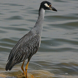
Main Image and big : http://esotek.zenfolio.com/nature/e3231601

Exif:
f/5.6 @ 210 mm, 1/500, ISO 500
 
Um. I like abstract, but this is too high for me.
 
It's very simple, which is good, but there are some things that don't work for me. First, the contrast needs to be managed better - a muddy range of greys does not impart the same level of impact that a wider range of tonal values will. In this case you've got a nice dark value in the cones but you lack enough value separation in the branch to pull it out of the background. This makes that image appear flat to my eye, both in contrast and in sense of depth.

Another thing that I would consider is the weight - all of the subject presented is in the middle and lower left of the frame. While negative space can be a very strong element in composition, the flat tonal range prevents the background from balancing the subject. There is a triangular composition formed by the branch (acting as the hypotenuse) and the cones, forming a triangle with the bottom of the frame that holds my eye in that part of the image, and that contributes further to the feeling of imbalance.

If it were me, and these are just my opinions and therefore should be taken with a grain of salt, I would do the same composition, but with the branch farther toward the upper right, so that the cones higher into the frame. Keep the depth of field - it's perfect - but move the balance point farther into the frame, and move in on the subject so that there is less background (which does not add anything to the composition) and more subject, and see what you think.

- Randy
 

Most reactions

Back
Top