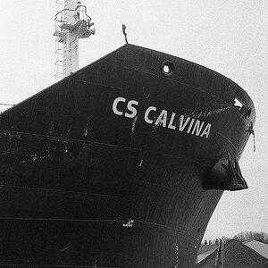
They're all too centered, and I don't care for the tilted composition in the third one at all... what were you going for there? It almost makes it look like you were trying to get that light on the side of the building in to the frame, but since there's no real reason for it to be there it's just kind of distracting.
I like the B&W treatment though, especially in the first two.




![[No title]](/data/xfmg/thumbnail/42/42452-e36799eaff36dca02ffc57ce660e5e20.jpg?1734176992)
![[No title]](/data/xfmg/thumbnail/37/37102-ef61523dcb48f0bd3a761c8bb5cea767.jpg?1734169829)