Back to the photos 2, 5, 9, 10: dislike
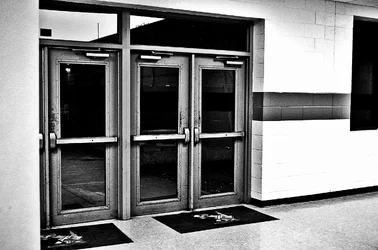
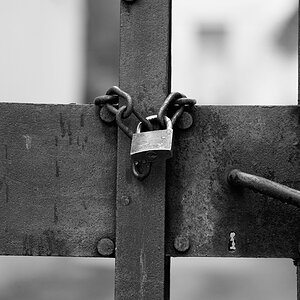
2: Not an interesting subject, b&w didn't bring any interest. Also too much of a "grunge" look in it. your contrast and clarity level (if you used LR) made whatever is on the door pop out. I'd expect this look when viewing industrial steel and such, not on a school door (which i wouldn't care to view anyways)
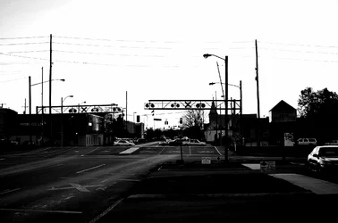
5: Sky blown out, everything else is under exposed and too much blacks/contrast. B&W isn't only about Black and White.....use some greyscaling. Plus the scene has a lot of clutter. powerlines, rr crossing, streetlights. nothing leads my eye
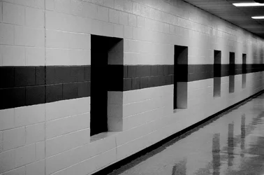
9: Again not an interesting subject. Maybe if you used the lines to lead my eye down the hall and in that top right third I got a square end to the hallway. Again, too much contrast..need some midtones
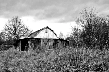
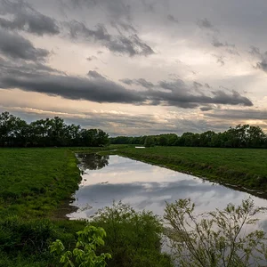
10: Too much distraction with brush in foregrount, too much contrast.





![[No title]](/data/xfmg/thumbnail/32/32003-70dfe149c27224e28ba98e975984e01e.jpg?1734160786)
![[No title]](/data/xfmg/thumbnail/32/32004-4455324f0b4b5cc318dd35877147ac47.jpg?1734160793)