What's new

Some photos . Please give some feedback

rato

TPF Noob!
Joined
Mar 22, 2011
Messages
4
Reaction score
0
Location
London, UK
Can others edit my Photos
Photos NOT OK to edit
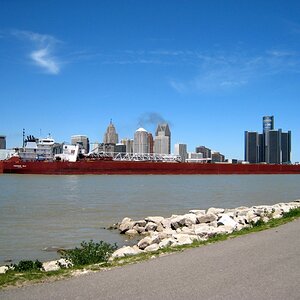
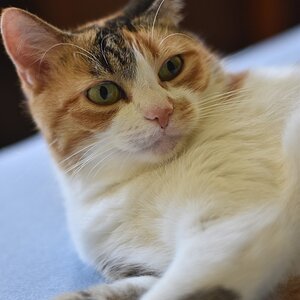
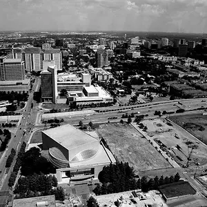
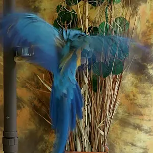
Hello guys, i'm a student from London and i'm passioned about photography and really wanted to receive some feedback on some of my photos in order to improve. Would really like to know what is wrong and what i could do best and what is good and well done as well.

If you prefer i have some more photos on Flickr here is the link: http://flickr.com/aeroratophoto
P.S.: Nevermind the iPhone photos!

Thanks!
Mike

1.
5541344519_2f5abb3f09_b.jpg


2.
5541923804_598c6b7d03_b.jpg


3.
5541923900_26acac3d45_b.jpg


4.
5541925500_42ea0baf4b_b.jpg


5.
67f35893c834b7d352674e90ba932645-d31p7kd.jpg


6.
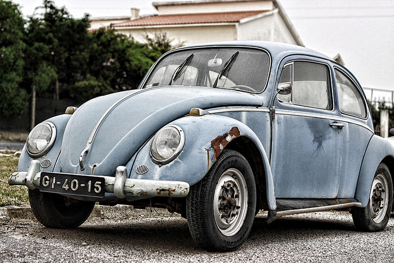
Volkswagen_1300_by_Aerorato.jpg


7.
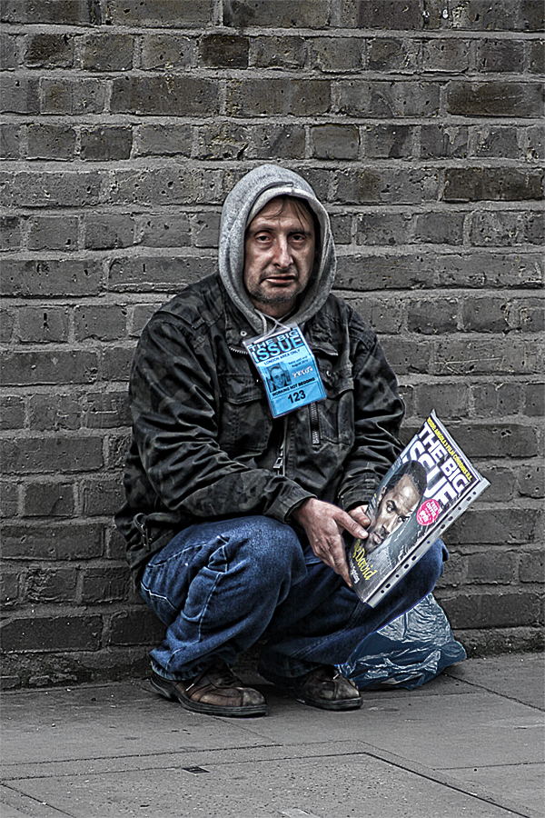
6c3a33315bd351eca379fa36fd3adccc.jpg
 
Last edited:
Well, as I am new here and an amateur, I may not be the best person to ask but here goes. Anybody can tell me if I'm wrong as well.

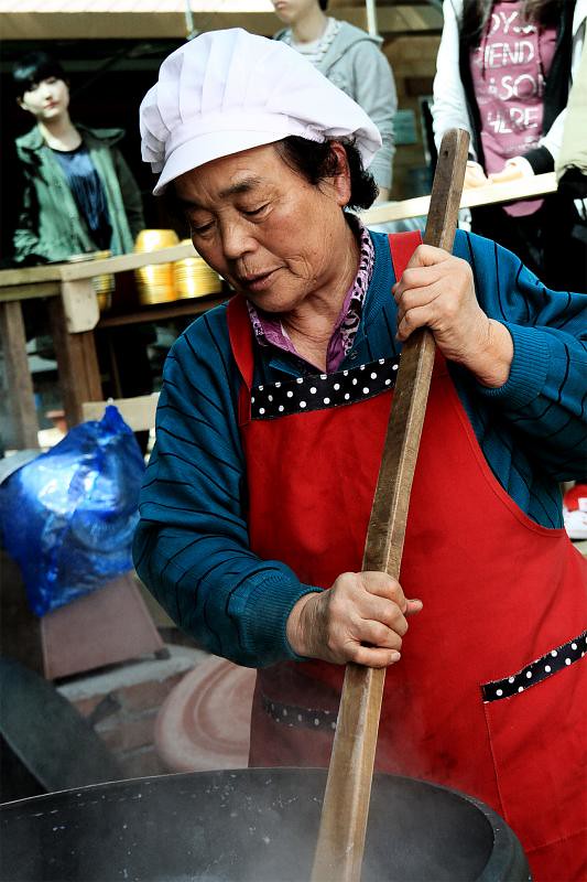
#4 Seemed to be lacking emotion. I don't know how you would get more emotion in this shot as I don't do people well myself. Also, it seem awkwardly at an angle. I do like the colors.

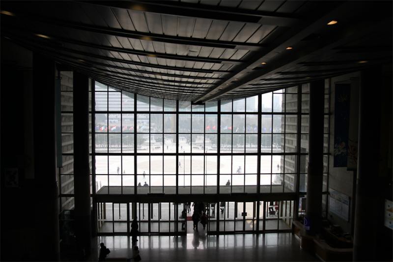
#3 I'm not sure what you were trying to accomplish and if you were to comment about that I could in return. However, I like the different angles but it seems to be blurry.

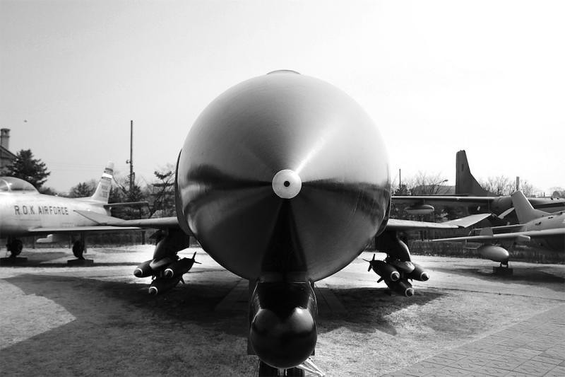
#2 This one I do like. The different size circles throughout the picture really works well. The only critique would be the cut off front wheel.

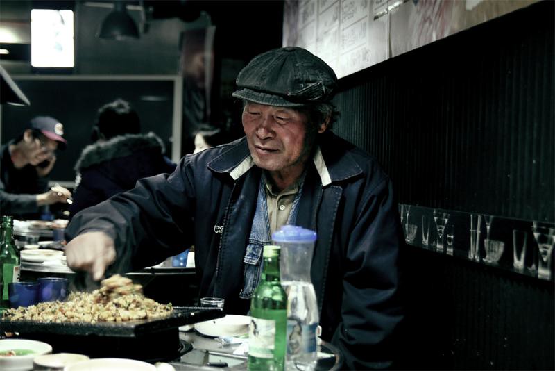
#1 I like this one as well. This one you seemed to have captured the emotion of the situation. I like the lighting and colors. It almost looks HDRish. I wish the hand and food didn't have the motion blur but other than that it's good.

Guess I'll comment on 5, 6, and 7 as well.

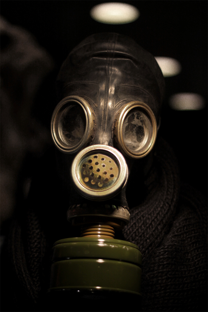
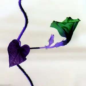
#5 If the green color of the can were to pop a little more I would like this better. Pretty good though.

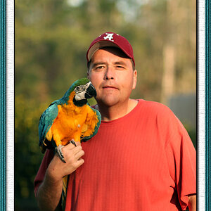
#6 I really like this one. Again you were able to bring a great color scheme together here. I wish the shrubbery was the whole backgroung and that the car wasn't cut off on the right side.

#7 This one is great. Color, Lighting, Focus all very good.
 
Last edited:
Mike,
#1 cool shot, move around more and become very aware of your background. A shift to the left would have gotten more of the food and less of the distracting diner in the background.
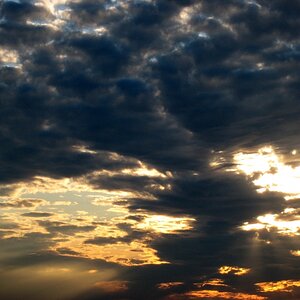
Like #2 but don't know how to suggest an improvement other than the background needs some clouds..
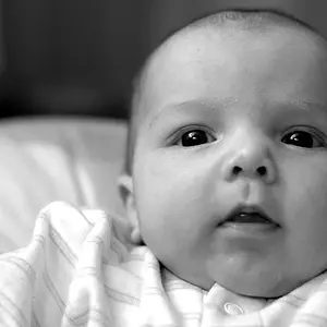
#5 is nice, but in my opinion could be just a bit lighter to see the sweater and maybe eyes.
# 6 and 7 have potential, what is making them so out of focus or pixelated? Get closer with both.
 
Hey guys, thanks for the reply's very constructive and great help.
Fern dunno what is making them out of focus to be honest. On my mac they seem alright!

More reply's are more than welcome! Thanks once again mates!
 
My feedback wont be constructive.. I just wanted to say i love number 6 and 7. They are awesome in my eyes. The dude in number 7 looks really gnarled... great colours, i really do like them! Well done!
 

Create an account or login to comment

You must be a member in order to leave a comment

Create account

Create an account on our community. It's easy!

Log in

Already have an account? Log in here.

Back
Top Bottom