What's new

Some Wedding Photos

Diddy2theJJ

TPF Noob!
Joined
Oct 28, 2008
Messages
288
Reaction score
13
Location
North Dakota
Can others edit my Photos
Photos NOT OK to edit
Hey all,
Here are some photos from one my recent weddings. I welcome any comments or critiques.

1.
HN-5.jpg


2.
HN-1.jpg


3.
HN-2.jpg


4.
HN-3.jpg


5.
HN-4.jpg
 
My critic is, go easy on the Clarity slider! You jacked up the clarity slider right?
 
what is #1?

#5 I like!
 
Trever, I'm looking at #1 and i see what you mean...in BW you can't tell quite as well haha. It's the bride's hair and the veil coming off of it.

#5 was my favorite too
 
#5 is actually my least favorite. Just throwing this out there from the point of view of a recent bride...you spend HOURS looking for that dress...you spend hours having your hair practiced on...and you can't see the detail in either of these things. The background color, her skin, her hair and the dress all sort of blend together because they're all kinda the same color.
 
I think it was only on the B&W photos that I did that....I'd like to post the color photos too to see if you guys like those better.
 
OK...here's the color versions. I'm seeing now that I will need to do some touchup on the hotspots on her face on 3...other than that, you like these better than the B&W? Are the B&W too sharp?

1.
HN-6.jpg


2.
HN-7.jpg


3.
HN-8.jpg


4.
HN-10.jpg


5.
HN-9.jpg
 
The b&w wasn't bad, you just made them too high key, and a lot of the highlights were blown.
 
#1 - perhaps different angle would be more pleasing. As it is, seems like bush w/ veil coming out of it.
#2 - BW love the processing.
#3 - Not a big fan of composition, building in the background is distracting. Lady behind the tree also doesn't add flavor to it.
Pose: awkward - next time have her turn more to HER left to get a somewhat of a 45degree angle w/ respect to the camera, lower the flowers and tilt them to the camera. Frame it vertical or crop it vertical,
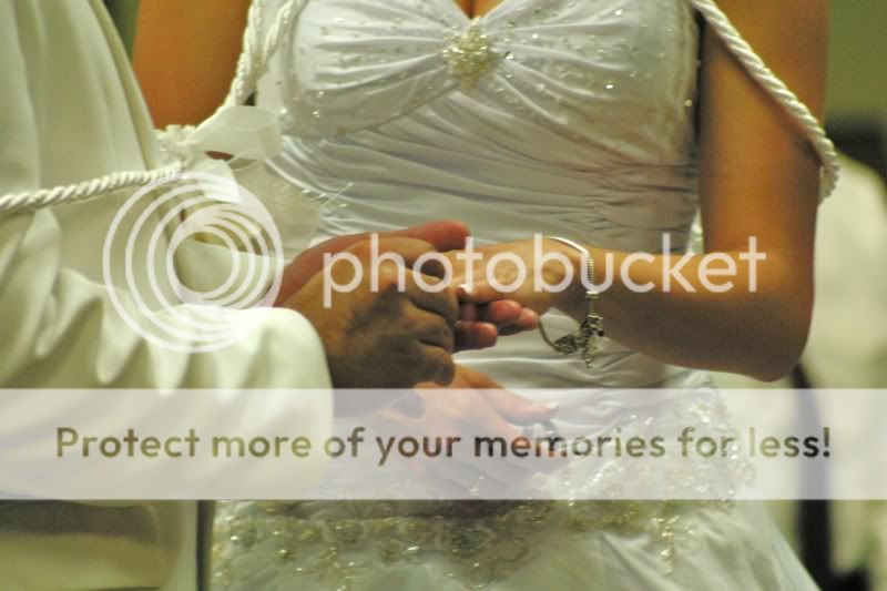
#4 - its one of those flavor shots. as it is in my eyes its trash b/c you can't see both hands, can't see the ring, man's hand is larger and dominates the frame.
#5 - same idea w/ posing as in number 3. Lift the chin up, she isn't a boxer and rim lighting would look nice on it.

Good Luck
 
#4 - its one of those flavor shots. as it is in my eyes its trash b/c you can't see both hands, can't see the ring, man's hand is larger and dominates the frame.
Good Luck

I think he was going for something like this.
85.jpg
 

Create an account or login to comment

You must be a member in order to leave a comment

Create account

Create an account on our community. It's easy!

Log in

Already have an account? Log in here.

New Topics

Back
Top Bottom