Starting Over-New Business Name?

I don't know about Ky, but in the states I do know about, if your business name doesn't include your last name you have to file DBA paperwork.

*sigh* Crap, you're probably right. I need to check with our local Chamber of Commerce...

Could you please let me know what you find out?
 
On a side note, if I end up having to get a DBA any, I was also considering Bright Beginnings Portraits.
 
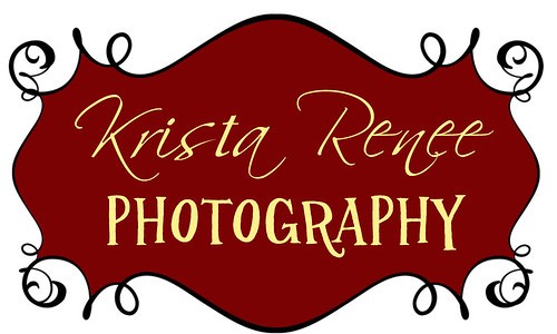
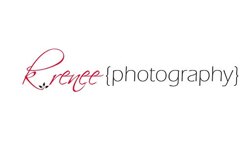
Here are two logo ideas:
5392323489
5392323489_45d3594aa0.jpg


and

5394013785_65a73f1409.jpg


5392323489

5394013785
 
Day care photographer, I like it! Charge the parents extra for some photos...and you'll have all day with the kids.

On a more serious note, I think that second logo looks nice. Simple, yet nice.
 
2nd Logo looks sharp! I would say be careful with the K, as it could appear to be an R. I am biased with K. Renee now as I have said it for over a day and it just has a smooth ring and flow to the name. If you wanted to incorporate a surname/slogan phrase with New/Bright Beginning attached, you could add that after, or under, the K. Renee Photography.

K. Renee Photograhy
Photographs that Speak

Obviously, I am not advocating my slogan for the end-all choice, but something maybe along those lines.... who knows?
 
Neither is very good. You've got mixed fonts in the first that don't work with the frame background very well. The second has that big loopy thing that looks like an R, as mentioned, plus the leaves don't really do anything, and you've got brackets around 'photography' for some reason. I'd keep working.
 
I was told when making my logo design to keep things simple, clear, and noticeable by all. All fonts should be the same (relatively) and it should visually flow as much as the name....
 
Logo 1: You have two decorative fonts in your logo that do not relate to each other. The frame is too large compared to the type and the fine lines in the swirls will not reproduce well on a small business card. The logo does not work in one color. If a logo cannot be represented in 1 color it is not a successful design.

Logo 2: I read it as "Rrenee Photography" The font relationship is a bit better as you have used a decorative font with a san serif. The { } serve no purpose. The leaves on the k are too small compared to the type and will not reproduce well. The lower case k and the leaves create too much spacing between the k and R.
 
Thanks everyone. I was looking at this site (Design by Jenn | Resources for Photographers), trying to come up with ideas, because I like her work. I can fiddle with the second one and change the font easily enough. It seems really plain though...I want something fun, but I'm having a brain lapse apparently. :)
 
One of the basic rules of graphic design is - It has to work first in black and white. Then color is added.

Trendy colors that are popular today, won't be in 2016.

Changing a logo often, is worse than having no logo at all.

A logo needs to be designed using vector graphics to ensure scaleability. Photoshop is a raster graphics application.

A mistake many photographers make is assuming they are as good at graphic design as they are at photography. Then they design a logo that is appealing to them, when it really needs to be appealing to the target audience, the buying public.

If you do not have graphic arts training, having a professional graphic artist design your logo is a smart move and not as expensive as many think.
 

Most reactions

New Topics

Back
Top