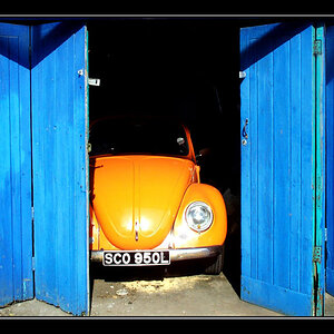
The first one is pretty OK. There's a nice little scene there, one gets the impression of something unfolding, something in progress. The composition is lacking, sticking the subject in the middle of the frame is usually weak, from a design point of view, and it otherwise looks flat and visually uninteresting. So, good content, not so great visuals. This is the challenge of street -- getting the great content AND the great composition simultaneously. It's very very very hard.
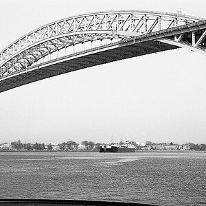
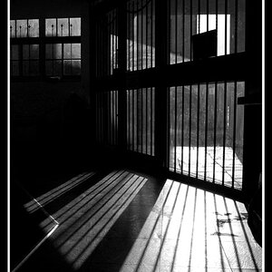
The second one is less good, to my eye. It's not street at all, it's some sort of abstract, without much going on in it. Again, you have what might be a "subject" dead center, and it's generally a somewhat weak composition. There are some strong graphical elements in it, strong lines running through it and so on. Reflections are often nice, but it's good to have something reflected, here we see one murky figure, maybe? You had an idea here, but I don't think it worked out particularly well.
Keep at it, though! You're definitely seeing stuff, and having ideas.
I'm going to suggest that when you're out in the world you experiment with moving yourself around. Pick two objects, and move yourself around them, toward them, away from them. Crouch down, stand up tall, climb up on something. Observe how the visual relationships between your two objects change -- sometimes they're lined up one behind the other, side by side, or diagonally "in the frame". They're bigger when you're closer, smaller when you're farther away. How does their relative apparent size change as you move?
To make great street photographs, all this stuff has to be instinctive, to get those good compositions in the instant that the good content appears.
(this is all just me paraphrasing Henri Cartier-Bresson, I'm no good at it myself, it turns out)