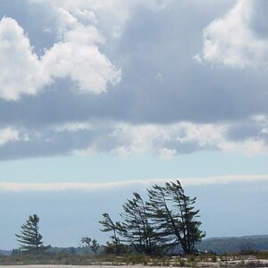
Ye i recon something is missing aswell, not quite sure what but also i recon the bottom right corner (the sun) is too bright in my opinion, others may think different though..
Ohhh yes I think that one's much better than the first. I think the original was just a bit much cloud vs sun. This one is nice and broken up and you get all those gorgeous colours around the clouds. But I still feel like it's missing something, you know to give it some relationship to the earth.... like a tree or some sort of perspective aiding object. I love the rays of sunlight!


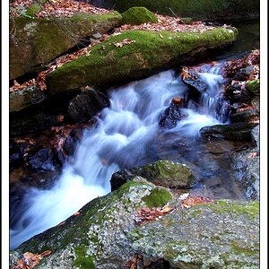
![[No title]](/data/xfmg/thumbnail/32/32805-61ca9a4fb87d37c0ef4f991ac1705e1f.jpg?1619735667)


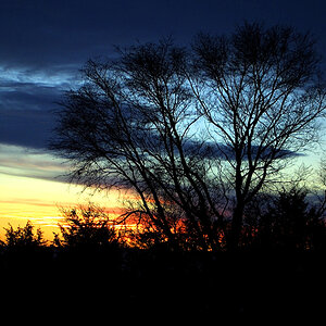
![[No title]](/data/xfmg/thumbnail/39/39290-dfb3e819bd94a7f30797638ae1ae27cf.jpg?1619738958)
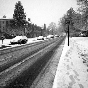

![[No title]](/data/xfmg/thumbnail/37/37525-e6d8ac7dbf90f97648e351449fc9330f.jpg?1619738130)