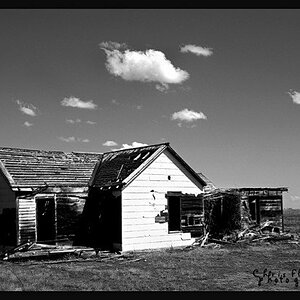
The first is too dark, and composition too centred. Clear division in two equal halves. One top. One bottom. Not quite so good.
Second is brighter, some detail to be seen in the clouds, despite the fact that you were spreeding past, but the moutains are still too dark. Though there's more detail there than in the first and some gradations from black to dark grey, which is nice. Gives the mountains more "reason" to be there (as a subject).

")
![[No title]](/data/xfmg/thumbnail/41/41782-daa26990361bf4193a874908bda10dbb.jpg?1619739891)
![[No title]](/data/xfmg/thumbnail/41/41783-314fbf7e0c66dfa41b2a2d535aa3a9cd.jpg?1619739891)
![[No title]](/data/xfmg/thumbnail/34/34139-e52deba745f42ba091907fcc460cd6db.jpg?1619736311)
![[No title]](/data/xfmg/thumbnail/42/42017-05f80a89ca2890969b5dc7cc47872581.jpg?1619739979)