What's new

Sunset pics, what do you think?

Mia331

TPF Noob!
Joined
Aug 12, 2011
Messages
28
Reaction score
1
Location
NY
Can others edit my Photos
Photos OK to edit
These are my first sunset pics which were tken yesterday. It was a bit hazy out but I wanted to try anyway. I am finding that it is harder than I thought to take landscape photos; or at least to my creative/artistic ability is lacking :meh:. Any suggestions you have are appreciated so I can continue to learn and improve my photos :D

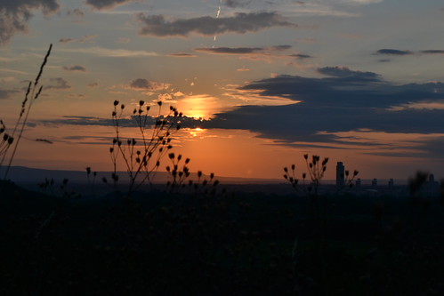
1. manual: iso 200 f/11 1/500

Sunset 8-24-11 003 by Jessica0613, on Flickr

2. landscape mode: iso 360 f/11 1/500
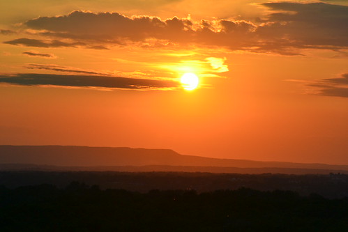
Sunset 8-24-11 012 by Jessica0613, on Flickr

3. manual: iso 100 f/5.6 1/1000
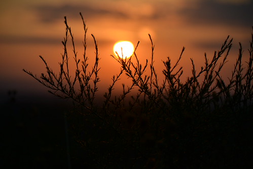
Sunset 8-24-11 016 by Jessica0613, on Flickr

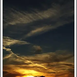
4. manual: iso100 f/5.6 1/1000
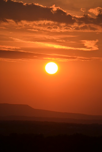
Sunset 8-24-11 020 by Jessica0613, on Flickr
 
Love #3, by far my favorite of the bunch, but a bit too much negative space on the bottom probably. I think #1 would have looked better with the sun in the top left or right.
 
Add some foreground interest.


Last edited by a moderator:
Mia,


#1
Too much foreground, I think. The black dead space in the bottom takes away from the subject. Having the flowers silhouetted is a very nice idea, but it doesn't work quite well, in my own personal opinion. That building thing also doesn't fit in, I think, in this natural photograph. Again, lowering the horizon would improve it, I think. Frankly, I think the silhouettes are just in the way, sorry :/ The idea is nice. Try finding an interesting looking silhouette, and not having silhouettes for the sake of having silhouettes. That said, it's a nice image. It's moody. I've been searching in my area where I've got a clear view straight west so that I can take some sunset pics of my own. It's good you're out shooting! :)

#2
I like the haziness of the mountains. I like the contrast in this image. There are four horizontal lines going across the frame. I'd wish the third line (counting from bottom up) was clearer. I'm not too sure about the placement of our closest star. I like the cloud. It's pretty red, but I like it! I like how the foreground almost is a black to red scale. I think a portrait crop, as in #4, would benefit this one.

#3
hmmmmmm
Perhaps a portrait orientation would be better? I wish the sun was more circular, and I wish more of the bushy thing were up in the sunset. But not too much bush (erhhhhh). Just a few sticks! Not sure about the depth of field.

#4
Your best shot, in my humble opinion. The horizon is more slanted here than in #2. Was the horizon slanted or straight? I don't mind it, they line up nicely with the clouds, creating a nice diagonal liney feeling. I think I wish the sun was lower, in the lowest half of the picture. Again, nice contrasts in the valley. And again, the black to red scale is very effective. Portrait orientation really works, I think. Me like very much!

The sky must be very spectacular if that's the only element in shots. Adding something in the foreground, like a silhouette as you've done, really makes things more interesting. However, in #4 I don't think you need it. It's just a lovely shot, imo.

Which lens(es) used?

:D

(did you take your avatar pic yourself? I'd be interested in seeing that one in higher res)
 
Last edited:
Which lens(es) used?

:D

(did you take your avatar pic yourself? I'd be interested in seeing that one in higher res)

I used the 18-55 lens for #1 and the 55-200mm for #2 - 4

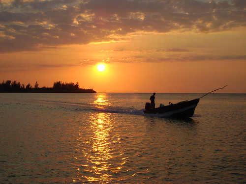
Yes, I took my avatar pic myelf on my honeymoon last year!! This is one of my favorite photos! I wish I had my dslr when I took this but I didnt own it back then and I took it with my sony cybershot...it was taken in Jamaica. We went to watch the sunset and I just happen to look up and see this and said I HAVE to get this so here it is, hope you like it :)


HM 2011 254 by Jessica0613, on Flickr
 
Add some foreground interest.


Thanks!! Great reference and my next steps are def to incorporate, work with and understand lighting and the other links will be helpful as I get into that more with the technical aspect :)
 
Last edited by a moderator:
You need better lenses. but pics are okay. just keep practicing.
 
I like these. I think a really thin pano crop on the first would look wicked.
 
I think the colors on all of these are great. Nice set.
 
You need better lenses. but pics are okay. just keep practicing.
The lenses the OP has are very capable of producing very nice results. Which "better" lenses would you suggest?
 
Here are two guidelines to try to keep in mind when framing landscapes.

1) Do not center the horizon.

2) Try to use the rule of thirds somehow, whether with the sun or an object in the foreground.

I really like the last photo, the different shades for the mountains is excellent.
 
Thank for the feedback! :mrgreen:
 
Yes, I took my avatar pic myelf on my honeymoon last year!! This is one of my favorite photos! I wish I had my dslr when I took this but I didnt own it back then and I took it with my sony cybershot...it was taken in Jamaica. We went to watch the sunset and I just happen to look up and see this and said I HAVE to get this so here it is, hope you like it :)

http://www.flickr.com/photos/66453638@N03/6081333592/
HM 2011 254 by Jessica0613, on Flickr

Wow this is really really awesome. horizon was centered, this is the only thing I could pick wrong.
 
Yes, I took my avatar pic myelf on my honeymoon last year!!

Nice getting a lovely sunset on your honeymoon :thumbsup: It's very moody!
 

Create an account or login to comment

You must be a member in order to leave a comment

Create account

Create an account on our community. It's easy!

Log in

Already have an account? Log in here.

New Topics

Back
Top Bottom