What's new

The local school

LaFoto

Just Corinna in real life
Staff member
Supporting Member 📸
Joined
Feb 1, 2004
Messages
34,813
Reaction score
822
Location
Lower Saxony, Germany
Can others edit my Photos
Photos NOT OK to edit
FintauschuleinBW_01.jpg


FintauschuleinBW_02.jpg


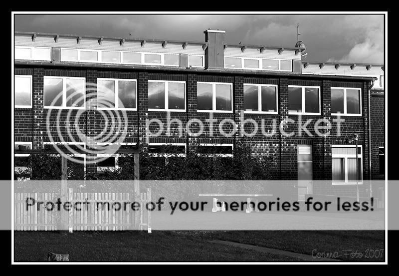
Channel Mixer Conversion
It is very hard to show in 2-dimensional photos that this building is a semi-circle ... must still find means to show this fact.
 
  • Thread Starter 🔹
  • Moderator 🛠️
  • #2
Any comments on the conversion?
The colour originals were also quite intense with a low sun against the dark, grey clouds, so I thought they'd render nicely for starkly contrasted black and white photos. Was I wrong?

And they were taken on a Saturday evening, hence no students... I would not have been allowed to be there with my camera (just so) otherwise, I guess.
 
Well, I think you did a great job on the conversions.

I especially like the second one. Nice and contrasty and the composition is excellent.

How are you doing your conversions? I am just curious. I convert about 90% of what I shoot to B&W and I use a plug-in to my PS Elements 2 called B&W Pro by the Imaging Factory (they are out of business now, I believe).
 
i prefer the second one, has great reflections in the windows and the contrast is good too.
 
  • Thread Starter 🔹
  • Moderator 🛠️
  • #5
Well, contrast was good in the colour version, to begin with. That's why I thought these two might go well through a conversion.

I create a duplicate layer, then go to Image -> Adjust -> Channel Mixer -> monochrome (little dot that can be set at the bottom of the new box which opens). I get a b&w photo, which is, however, often far from how I want it. But by moving the sliders, I can see what I like. That is what I did. :D

Thanks for coming by and commenting! :D
 
I think the conversion is good, I do some of my black and whites that way! I also think it was a pretty good subject for B&W
 
I like the first shot the best. The sky helps a lot, as well as the shadows. I don't like the foreground, though. It's flat and devoid of subject matter. I think the shot is definitely in need of a re-do in post. I'd like to see a much broader tonal range in the sky, and it still has that plasticky digital black and white look to it.
 
I think I like number 2 better because the school's details are sharper. I like them both, however.

Good job!
 
  • Thread Starter 🔹
  • Moderator 🛠️
  • #9
And this, Max? Also plasticky? (I know, the subject is TOTALLY different)

Meyerhof.jpg
 

Most reactions

Back
Top Bottom