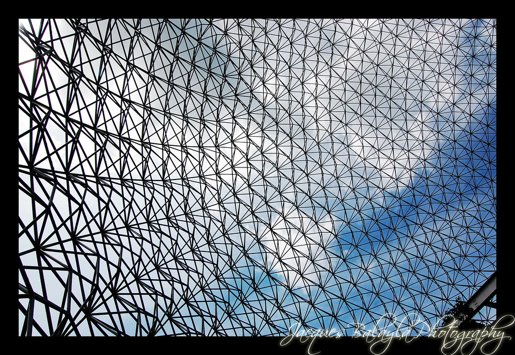
I like the abstractness of Photo 4.
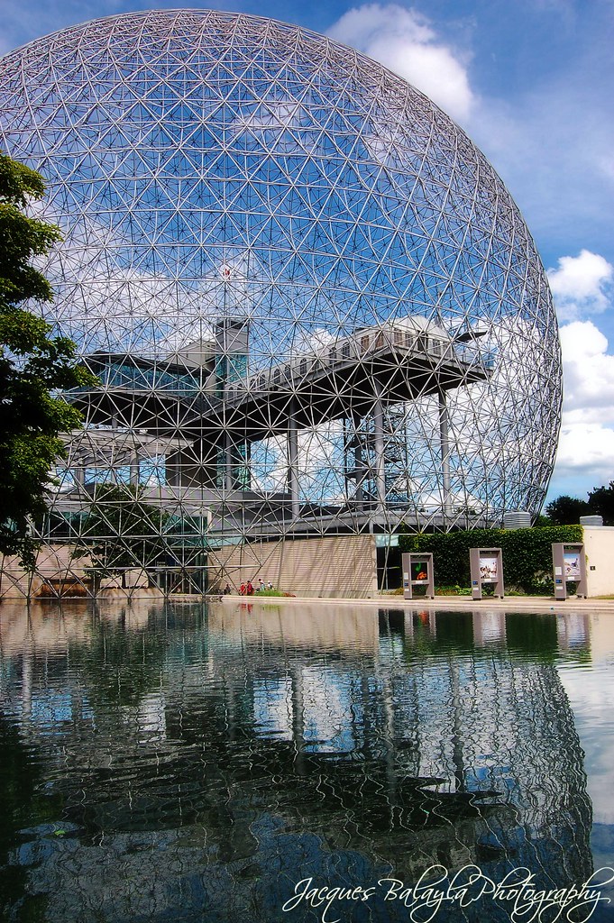
And the pano view in Photo 7. The sky looks a bit artificial, though, as if it weren't the original sky and you had to patch up a sky that would match the size of the pano (funny looking immediately left of the sphere).
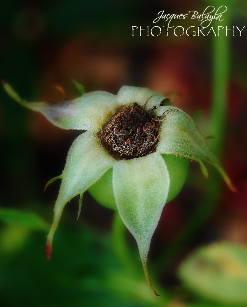
The colours in 3 are so intense... they look almost over-saturated.






![[No title]](/data/xfmg/thumbnail/39/39479-b21bb968588fb225cd453013c6512c9a.jpg?1734173577)
![[No title]](/data/xfmg/thumbnail/37/37109-62e1b65e6f8bd2a349250acd6d653f1e.jpg?1734169830)
![[No title]](/data/xfmg/thumbnail/37/37603-739c5d9b541a083a12f2f30e45ca2b7b.jpg?1734170731)
![[No title]](/data/xfmg/thumbnail/35/35953-1a8b92df0115ff7026f31b78855ac815.jpg?1734167764)
![[No title]](/data/xfmg/thumbnail/35/35948-700e0d840da0ca73727b1bd6d99b4142.jpg?1734167751)