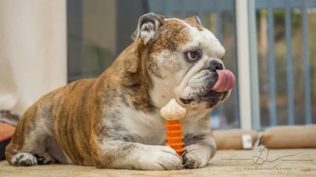
The first is a little over filled, I think. It looks flat and not visually interesting.
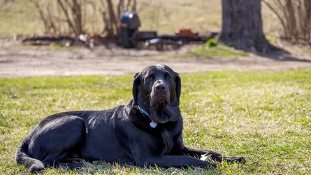
the second could have used some fill. The black dog is almost lost where it's shadowed.
Both have excessively busy and uninteresting backgrounds that detract, even though you did your best and threw them out of focus.
The dogs themselves appear crisp, in focus, and fairly charming. Slightly better light and better backgrounds and you'll have something very nice.