thoughts

er111a

TPF Noob!
Joined
Jan 30, 2008
Messages
1,896
Reaction score
6
Location
Virginia
Website
er111a.blogspot.com
Can others edit my Photos
Photos OK to edit
thanks
new-1.jpg
 
Reminds me of the time in college when I tried a "whipp-it"
 
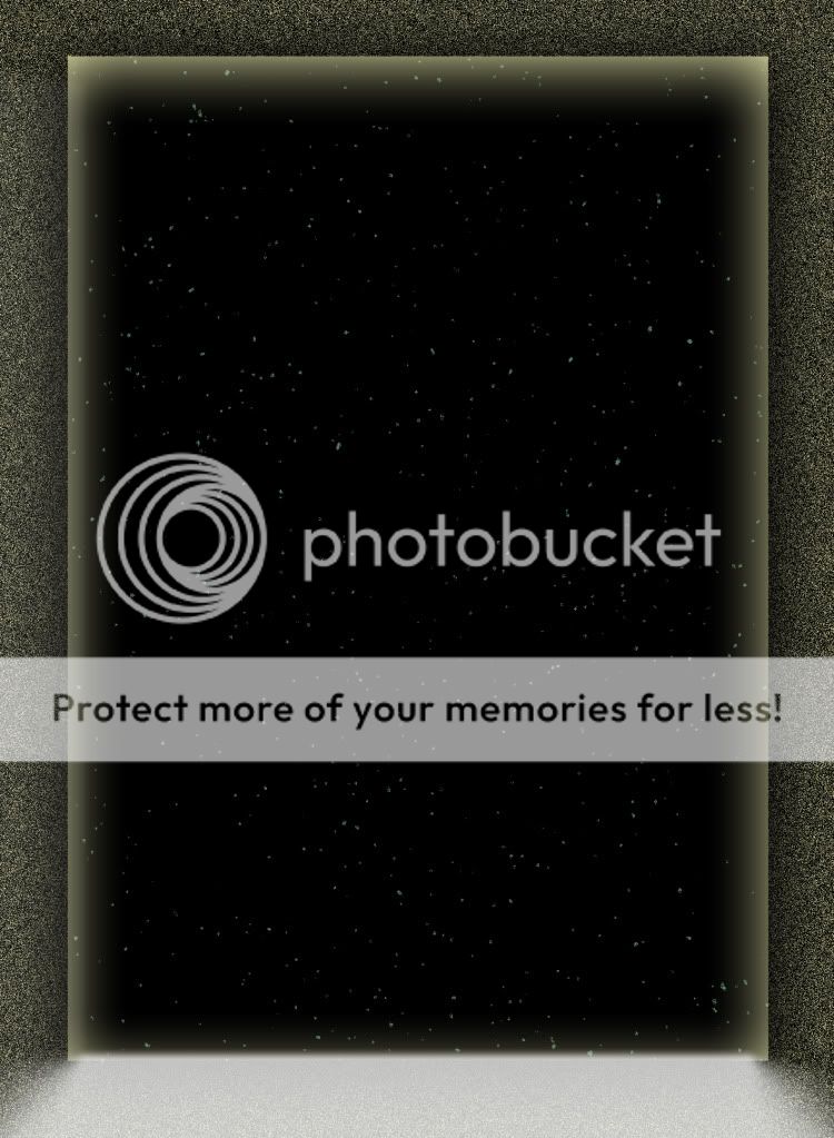
It's abstract - guessing it's a shopped up picture of the stars? I think star shots are best with some kind of foreground element, for context's sake.

Sorry, not feeling it, er111a. I won't be an ass about saying it though..

Reminds me of the time in college when I tried a "whipp-it"

lol..

"wawww wawwww wawwwwww"

EDIT: Wasn't calling you as ass Boomn, it's the people who are overly insulting that get on my nerves.
 
smh. Could you explain the reason behind the bottom of the frame being white? Out of all your PS jobs, I think this one might be my least favorite. I like star shots and if thats an actual shot you took, good job BUT the border with inward and drop shadow seem to be a bit too much.

Suggestion: Since you seem to consistently post overly shopped jobs, maybe explain the steps done for it instead of just throwing it out there, for those that might like an aspect you've done in a shot.
 
I think it's supposed to be a door, and that's why the bottom is white. I'm not sure, but that's what I think haha.
 
not for me.
sry dude.
i see stars...a noise filter, an outer glow layer effect, an inner glow layer effect...and then the white at the bottom. this must be over my head.
 
not for me.
sry dude.
i see stars...a noise filter, an outer glow layer effect, an inner glow layer effect...and then the white at the bottom. this must be over my head.


I was thinking the same way, until I noticed his inner glow and outer glow are the default value and color ... so I'm thinking he 'just did it' , then I felt better about myself lol
 
Haha I didn't say I see a door. I said I think that's what it's supposed to be. And I think I would maybe see it like that if the inner glow were gone.
 
I think armorgames keeps me entertained for several hours in the day and I'm going to have a burrito for dinner tonight.
 
not for me.
sry dude.
i see stars...a noise filter, an outer glow layer effect, an inner glow layer effect...and then the white at the bottom. this must be over my head.


I was thinking the same way, until I noticed his inner glow and outer glow are the default value and color ... so I'm thinking he 'just did it' , then I felt better about myself lol

cynicism is so hard to translate over the innerwebz...i should put a :er: after it or something...its not over our heads. theres nothing 'heady' about it. unless he comes in to explain otherwise, i think he indeed did just hit the buttons and hoped it looked ok.


beef and bean, vi? little pico de gallo maybe? some guac? rice? what're we talkin' here...
 
Mondrian wasn't understood by the uneducated, untrained masses of his time either...the simple-minded always need direct, obvious, hit-them-over-the-head-repeatedly types of representational "art" (or kitsch) so that they feel 100 percent within their comfort zone.

Mondrian - Google Search
 
Not sure what you mean by this Derrel, seems as if you are calling us 'uneducated' or 'simple minded' b/c we can't understand errr lol. Personally, I like Mondrian's work, even if you don't understand it ... it's pleasing to the eyes.

What are your thoughts on the shot Derrel? I'm interested in what you gotta say, especially since you seem to be sticking up for this work of art. :)


Edit: And putting er111a on the same level or comparing him to Mondrian is kinda silly lol.
 

Most reactions

New Topics

Back
Top