What's new

Tips to improve 3 pictures?

Heitz

No longer a newbie, moving up!
Joined
Sep 10, 2011
Messages
941
Reaction score
145
Location
Chicago, IL
Can others edit my Photos
Photos OK to edit
Hi, new to photography and new to this form. Was hoping for a few comments.

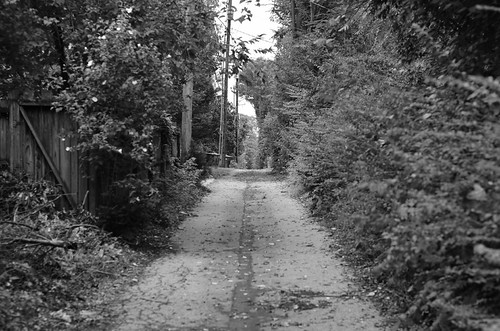
For pic #1, I like the location and the feeling of austerity; what might I have done to improve the shot?
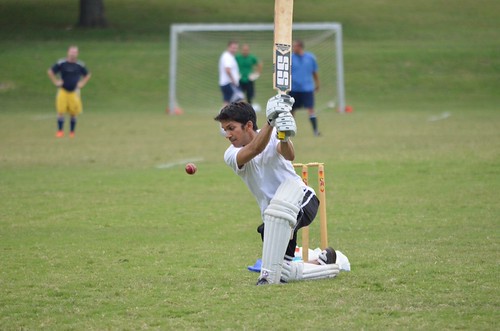
For pic #2, does it have any value? I like that I froze the ball mid-air, but it lacks a feeling of energy
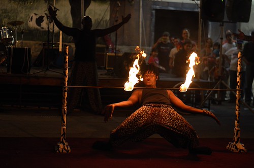
For pic #3, just general comments. I'm not sure its any good.

Thanks!
1
6134935775_08e5e907e4.jpg


2
6137594687_898e560639.jpg


3
6134937373_a146aef83c.jpg
 
Some of my thoughts...

#1, This is not too bad, rather than have the pathway running right down the centre of the photo, I might have moved a bit so the pathway comes into the image in the lower left corner and goes towards the middle - compositionally, the diagonal lines may be a little better than the vertical lines you have here, as the vertical lines of the pathway tend to cut the image into two halves - not that vertical lines are not a good thing, it all depends what you do with them. The conversion is not too bad, but I would like to see a colour version as well, because for a black and white conversion to be good, it is best if you can have some black areas and some white areas, whereas this image is pretty well all shades of grey. How did you do the conversion?

#2. This is really just a snapshot to me - the background is very distracting and you have people "growing" out of the batter's head. Shot from a different angle with out the background clutter may improve this sort of action shot. Also, maybe instead of "stopping the ball", you could one of two things - 1) lower the shutter speed so the ball is blurred, or 2) pan with the ball and blur the back ground just a bit - gives a sense of action IMO...

#3. Idea is good, but this is still just another snapshot - underexposed and with a very distracting background. Maybe shooting from a different angle to get rid of all the people in the background - don't know...other thought, maybe a bit of fill flash would help.

My 0.02¢.

Cheers,

WesternGuy
 
Hi Rheitz,

I'll give some of my opinions too (I didn't read all of WesternGuy's, so I may be repeating some of his).

#1. I like the idea. The main distracting element is the out-of-focus bush on the right of the image. Because it's closer to you than anything else in the image most the frame seems in focus except for this blob and my eye is drawn to it. I would also have another go at the B&W conversion going for more contrast, i.e., more blacks and whites rather than different shades of grey.

#2. This would've been good if you hadn't cut the top (or rather, bottom!) of the bat off. Cropping this down so that the batsman is on one of the thirds will help, but that half bat has ruined any hope of properly rescuing this one.

#3. This is the best one in my opinion. It desperately needs straightening - the floor is wonky, but I like the guy in the background with his arms up and the onlooking crowd. There's a nice glow from the fire lighting up the dancer and there's enough detail to see as much of him as we need to. It may be a smidge warm, but this is a personal view rather than an error.

You've some stuff to work on regarding composition and details before pressing the shutter, but these are not that bad.
 
A quick edit in photoshop...

Ball.jpg
 
Now THAT is better. So you did have a shot with the whole bat after all! The focus in this version is a bit soft, but the composition is improved ten fold.
 
This is a philosophical issue about composition. I don't think that the entire anything needs to be in the shot if the clipping of the 'anything' is matched by closeness in other areas.

In other words, while the original of this looks badly framed - a picture like this below doesn't bother the viewer who knows what the end of the bat looks like and the end isn't important to the shot and the framing is intended and not a miss.

Why I think this picture doesn't have any energy is that everything in the picture is static. The ball is stopped, the guys in the backround are solidly planted in place, the batter is at the end of his swing and there is no emotion on his face.

6137594687898e560639.jpg
 
The center of an image frame is not a very dynamic place in the frame, which is how the rule of thirds came to be.
The 1st image leads the viewers eye right to the center of the frame.

Your camera gives you 2 framing possibilities, the horizontal (landscape) framing of these 3, though the camera can be turned 90° to a vertical framing (portrait).
I suggest that #1 would have been stronger shot with a vertical framing.

Visit Guidelines for Better Photographic Composition. for some guidance on visual image composition, and you will find a great collection of tutorials at Digital Photography Tutorials.
 
I really thought the second photo was nice. I recropped it a bit, and amped the colors. I hope you don't mind. You didn't say in your profile whether that was ok or not. If not, I will remove it.

6137594687_898e560639redo.jpg
 
Bennielou, yea, that's totally cool. can you elaborate a bit on how you 'amped up' the colors? Its a great job - you pulled a much more pleasing shot out of a wider canvas.
And thanks everyone else for the thoughtful comments. I'm working on composition (well, everything really).
 
Now THAT is better. So you did have a shot with the whole bat after all! The focus in this version is a bit soft, but the composition is improved ten fold.
It's not a shot with the whole bat, i added the rest of the bat in PS but forgot to sharpen it a bit, i guess that's why it looks a bit soft...
 

Create an account or login to comment

You must be a member in order to leave a comment

Create account

Create an account on our community. It's easy!

Log in

Already have an account? Log in here.

Back
Top Bottom