You fooled me there. I thought I was going to be looking at a closeup of M42 (Great Nebula in Orion).
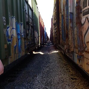
But since I'm here... I find the left portion of the front grey wall to be somewhat detrimental to the image. Not exactly sure why, but the vertical line and the two small portions above it to be somehow not fitting. But that's just me.
I don't get the point of this photo. If it brings a message I missed it.
It doesn't quite work for me. There are some different shapes and also some repetition, but the composition doesn't provide a path or organization for the image. It seems to kind of dissipate over on the right side. There's something there, so I'd try to go back and reframe.

Don't hate me Fred, but...if that is the point...the angle is weak. That's why the message (to me) doesn't arrive.It's about shapes and lines, tones and texture. Contrast. The order and organisation is permeated by imperfection.