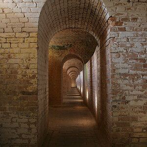
Very interesting shot, it held my interest for quite a while. I like how you can see light between the pages, which of course makes the scene dynamic. I think I'd like to see the left side a bit darker, simply because it's the brightest area of the frame and it distracts the eye a bit from where the real action is.
Very interesting shot, it held my interest for quite a while. I like how you can see light between the pages, which of course makes the scene dynamic. I think I'd like to see the left side a bit darker, simply because it's the brightest area of the frame and it distracts the eye a bit from where the real action is.
Very nice.
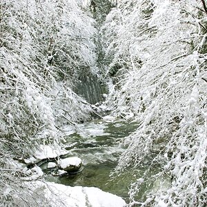
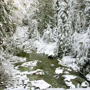
I think I prefer the original over the edit.
I like the way the shadows trail off rather than drawing attention to the bottom right of the photo.
Thank you all for the comments, observations and suggestions.
I having the original printed so I can evaluate it. I expect there will be a tad more definition in the lower right corner and I want to also evaluate it before I do any sharpening. The original has none.
I'm surprised no one has mentioned wondering how I rendered the light low and deep in the 'waves', there in the lower right. :scratch: There actually isn't any light there. The 'back' of the waves were all closed. The image is a negative.


![[No title]](/data/xfmg/thumbnail/42/42280-60cc6d4893a2f440eac7dd2248e733a9.jpg?1619740088)