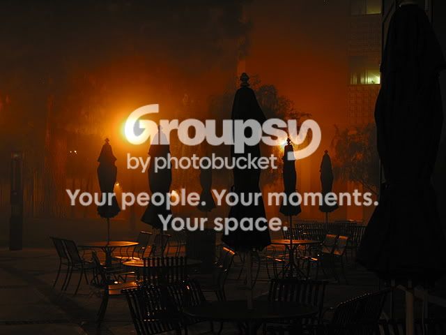
#1 has some nice lighting, but is compositionally lacking (there is some distracting extra space on the left).
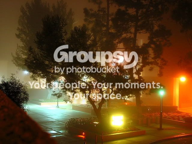
#2 is one of my favorites of the lot. Except for the wall(?) that appears in the lower left of the frame, this shot has really cool lighting. Unfortunately, you were not able to get the entire tree into the frame (I assume that there is another tree above it that would have ruined the composition.)
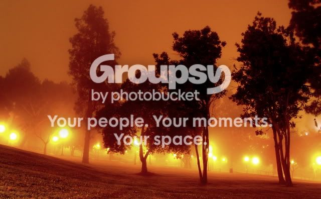
#3 is very nice. However, once again, the composition could do with some work. As the viewer, what are we supposed to be looking at? I think your main subject was the lights and the trees. But I think you would have gotten a better image if you had focused on one tree (perhaps being silhouetted by the heavy backlight?), instead of however many you could fit in one frame.
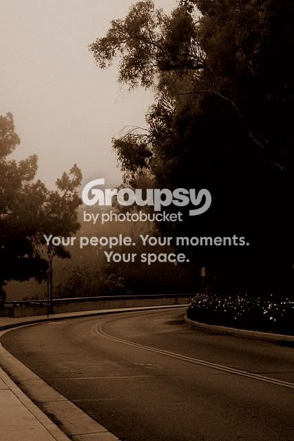
#4 is compositionally very good. There is nothing really wrong with this image. However, it could use a bit more of a subject, but it's not really a problem in this photo.
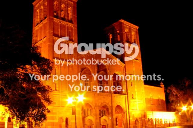
#5 is the least good of all the pictures in my opinion. The shot is overexposed, and the tree at the left is distracting, and the composition is not powerful or striking. I would recommend trying to get a better angle next time. Maybe try getting further away so you can comfortably get the entire building in the shot.
Overall, I really think you have some great ideas with that early morning artificial light in the first few pictures, but you need to execute them better by working on your composition. For example, before taking your shot, make sure that there are no avoidable distractions (walls, tree branches, etc.)
btw, I'm sorry if I was too harsh....




![[No title]](/data/xfmg/thumbnail/32/32946-74023d9d5e025fc03f754a05cb917646.jpg?1734162791)

![[No title]](/data/xfmg/thumbnail/31/31041-5783ca3812325c3201a2dd513def662d.jpg?1734159146)

![[No title]](/data/xfmg/thumbnail/32/32943-1a3c3a399438cf2fc6a21415e9bdedcf.jpg?1734162774)



![[No title]](/data/xfmg/thumbnail/32/32942-4440dd4ca2ff307a5d19277feedf1d94.jpg?1734162769)