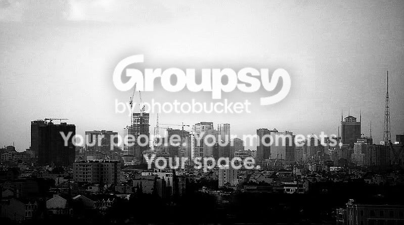
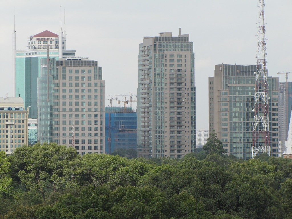
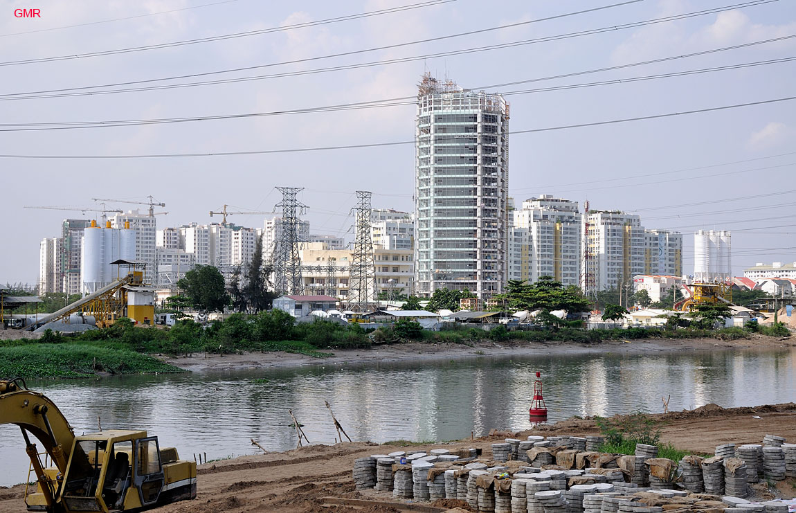
1,2,3 and 5 are too blown out. Not much going on in 4. 6 and 11 are too oversaturated, 11 almost gets away with it but 6 just looks weird. 13 and 10 are too soft and/or blurry. 8 is pretty good but has too many distractions.
Now for the good.
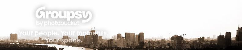
7 is a great pano, its an interesting vantage point with lots of visual interest, good use of sepia tone here. although the horizon is off, but overall I like it, and think it's a good photo.
9 is gorgeous! great contrast of colors. The straight building in front really adds to the diagonal houses in the middle and the curve of the background. The sky is beautifull with interesting couds wich are exposed well. Just a all around great photo IMO
12 is just cool. Good detail and sharpness, with a good amount of contrast especially from such a great distance.











![[No title]](/data/xfmg/thumbnail/34/34114-dd12be026979ccd4182c5f478bd91448.jpg?1734164566)
![[No title]](/data/xfmg/thumbnail/31/31035-96228fec87f6f8e8b5f3db4e93e99189.jpg?1734159134)
![[No title]](/data/xfmg/thumbnail/37/37607-69784b19e25bd0ba68e92ff4cfdfa8ff.jpg?1734170734)