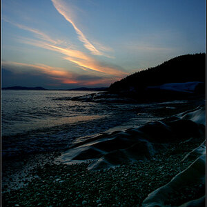
Thoughts/suggestions? IMG_9356 by RxForB3, on Flickr
R RxForB3 No longer a newbie, moving up! Joined Feb 10, 2012 Messages 654 Reaction score 76 Location Yakima, WA Can others edit my Photos Photos OK to edit Jul 2, 2012 #1 Thoughts/suggestions? IMG_9356 by RxForB3, on Flickr
480sparky Chief Free Electron Relocator Supporting Member Joined Mar 8, 2011 Messages 25,160 Reaction score 9,010 Location Iowa Website pixels.com Can others edit my Photos Photos NOT OK to edit Jul 3, 2012 #2 Kinda flat. Bring the black point up, and the white point down. As for comp., could've aimed so the center of the web is more in line with the Rule of Thirds.
Kinda flat. Bring the black point up, and the white point down. As for comp., could've aimed so the center of the web is more in line with the Rule of Thirds.
OP OP R RxForB3 No longer a newbie, moving up! Joined Feb 10, 2012 Messages 654 Reaction score 76 Location Yakima, WA Can others edit my Photos Photos OK to edit Jul 3, 2012 #3 Thanks for the suggestions. I'm not sure if this is what you were suggesting (editing definitely isn't my area). I'm using lightroom 3, so wasn't quite sure how to translate what you said into results. IMG_9356 by RxForB3, on Flickr
Thanks for the suggestions. I'm not sure if this is what you were suggesting (editing definitely isn't my area). I'm using lightroom 3, so wasn't quite sure how to translate what you said into results. IMG_9356 by RxForB3, on Flickr


![[No title]](/data/xfmg/thumbnail/37/37605-90c8efaef5b7d1f52d4bf8e7dfd33673.jpg?1619738148)
![[No title]](/data/xfmg/thumbnail/32/32701-51bacbc6ea9d40683123c14f053d4742.jpg?1619735603)
![[No title]](/data/xfmg/thumbnail/32/32702-7344d6e6132276dd7bfc046084fea432.jpg?1619735604)