What was he thinking?

suryad

TPF Noob!
Joined
May 17, 2005
Messages
101
Reaction score
1
Location
GA
Dont know if this is the right place to post....but which one do you like better?
IMG_1840.jpg


IMG_1840-1.jpg
 
The color of the clothes vs. the background is too good not to keep. I'd just work with the curves a bit to bring it out. Expose for him, not the background.

I'd also crop off some of the stones on the right.

There's a bit of a story there. Cool capture.
 
Thanks. I am not a comfortable PS user yet but I will try.
 
O I love the first one with the color!! That color is just Shimmering with the background... Very nice picture..
 
Thanks. I am gonna play with that pic some more and post a newer revision. Maybe that will work better.
 
suryad said:
I like it better. It's still a bit dark on my monitor.
There's not much you can do about it now, but I would have liked to see his feet in the picture, too. Checking the frame edges comes from a lot of practice, and I still cut things off by accident myself. You don't always need everything in, but it's good to make it a conscious choice. Since there is so little cut off (just his feet), I would have left them in.
 
Yeah Mark I see what you are saying regarding the pic being a bit dark. I think it was either camera settings or the fact that I think it was 8-9 in the morning. I was in a train when I took this picture. My side of the train was towards the platform...so i had to zoom in through the window to take his pic. Lucky the windows slid up and out of the way.

As for his feet being cut off, since the train I was in elevated me much higher above the ground, I thought that if I try to make it so that it appears I am not looking down on him, maybe it would look better. So I just took the pic and had to sacrifice his feet! :p
 
Wow. You had a lot of limitations to work under. I think you did a great job. I think the exposure was thrown off because everything is so well lit behind him, and he doesn't have any direct light on the front.

I asked suryad if I could post my edit, so this was along the lines of what I was thinking. I used a levels adjustment to lighten the midtones, then used curves to further tweak the mids and darks to bring the contrast back up and did a smart sharpen. If I was going to spend some time on it, I would use a mask so that the background wouldn't be lightened so much.

revised4-mod.jpg


The crop is just my personal taste. It feels more balanced to my eye, but everyone likes to see different things.
 
Whoa nice PS job! I like the way it looks...one thing I dont quite feel comfortable about PS and that is probably why I dont like using it much is that...somehow I feel like I am cheating in getting to change so many different things through it. I mean a bad photographer can pull out some awesome pics then if he is quite adept at PS! Should I be thinking that way or should I be thinking I need to learn to use the camera a lot better so I can minimize the use of PS to enhance my pics? I am rather conflicted about it. Bada Gora, a user of this forum tells me to imagine the pictures taken thru a DSLR as a digital negative and the actual picture will surface after PSing the pic...somehow I dont feel quite comfortable with that.
 
suryad said:
Bada Gora, a user of this forum tells me to imagine the pictures taken thru a DSLR as a digital negative and the actual picture will surface after PSing the pic...somehow I dont feel quite comfortable with that.
That's the way I look at it, but I know a lot of people who are uncomfortable with it, also. I was having this discussion with a friend of mine yesterday.

I look at levels and cuves adjustements, color balance, etc. the same way as I do darkroom adjustments. They are just adjustments. It's not like sticking a purple cow in the middle of an orange ocean. And it's not like you can't make some pretty crazy stuff in the darkroom. Take a looks at some of Jerry Uelsmann's work.

Using a curves adjustment in PS is like choosing a contrast filter for your enlarger. Using masks is like dodging and burning. In fact, there are tools in PS that are named after the very same thing you do in the darkroom. Even unsharp mask.

I think it's best to get the best possible image you can right at capture, but I also think that it's a shame to let a good image not become great by just letting it go as-is. Personally, I use all this post-capture editing as a way of training my eye so I'm more likely to get what I want in camera. By trying out all sorts of crops to find the one I really like, it's as if I took a lot of different shots. I can than use what I learned the next time I look through the camera, and I'm more likely to get what I want without having to edit.

Most of the great photographers either were master printers themselves (like Ansel Adams), or they use a trusted printer who knew what they wanted to get as an end result (like James Nachtwey). Very few will just toss a negative in an enlarger and call it a day. Even if they don't dodge/burn/etc., they still make sure that the print has a good tonal range and contrast.
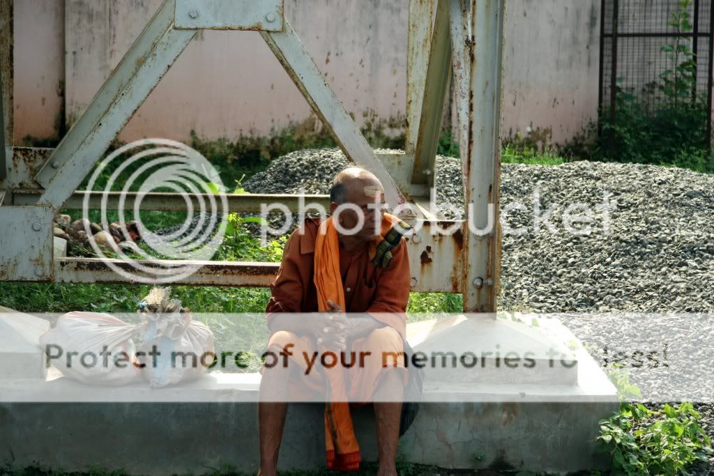
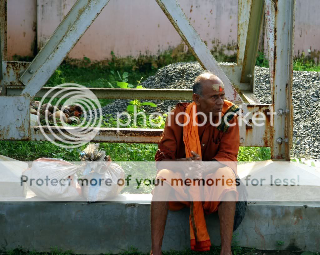
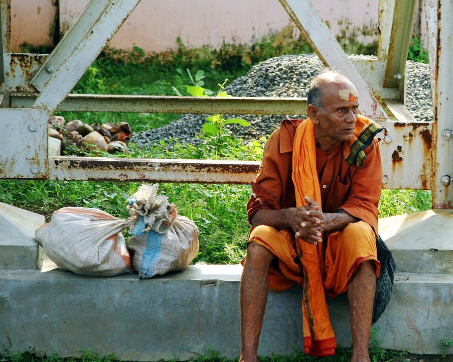
 
Definitely color!

Shooting film for the first 3/4s of my photo life taught me soooooo much. When I finally got a dSLR a few months ago I felt like I could really make it sing.

I'd say strive to do as little editing as possible with your in camera composition, whitebalance, color, exposure, etc. But do as much editing as you need to do to get the image you're happy with.

Oh, and the black and white would work with a much closer crop of just the man. And your conversion seems realllllly flat. Did you just desaturate?
 

Most reactions

Back
Top