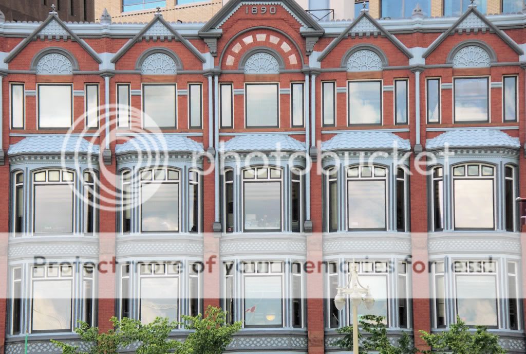
I like the Re do on this Much Better!! Nice Clone Job on the light, but removing the background bldg. really put it into perspective... a bit more cloning than I would want to take on , and sure after involved , you must have felt the same way..
This would probably be next to impossible to get any straighter I suppose.. but it still has that tilt feel to the left... Think it was because the Orig, shot was not taken dead on , at same level or plane of height as subject.. more or less meaning , you were shooting up some..and really not dead on straight..
The window glass in your orig. seems to be better controlled as far as glare or flare... must be the extra enlarging in second shot changed the previous work ??
but overall , I like what you have here, very interesting shot !! great Patterns !


![[No title]](/data/xfmg/thumbnail/41/41892-d6f91fd1c816420825658ffaad56df78.jpg?1734176245)
![[No title]](/data/xfmg/thumbnail/42/42458-8274869c9294d2f0655f80c8f0e6048c.jpg?1734176996)


![[No title]](/data/xfmg/thumbnail/41/41904-bc50f4d1903ad14e244dbad5cf8e5aa4.jpg?1734176269)


