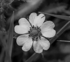
I think I like it. petals look like hearts and the leaf things going around it add some contrast to the roundness of them and a mishappen framing. Nice shaped flower it is very interesting.
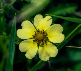
Converting it to black and white helped bring out some of the detail in the petals that was otherwise washed out by its original yellow color. The shadows are more prominent and the inner part of the flower is more contrasted and it "pops" more than it did in color.
you asked would it be better in color but didn't show us the color version... and your reply implies that you're sure in your choice so I'm a bit confused
I personally can't give you a decent opinion because I'm viewing it on a crappy comupter
I'm not a big fan of b&w flowers, however it does work for some. I don't think it works in this case because there are too many other elements [leaves] in the photo. If the flower was isolated against a blurred background then the b&w conversion would probably have worked. As is, the flower is already competing for attention with the the three in focus and one blurred leaf that are boxing it in and with the b&w conversion the flower gets lost in the jumble.
Converting it to black and white helped bring out some of the detail in the petals that was otherwise washed out by its original yellow color. The shadows are more prominent and the inner part of the flower is more contrasted and it "pops" more than it did in color.
Post the color photo, and change your edit preference so we can show you what you might be able to do with it.
The detail in the petals likely could be brought out in the color version using the right image editing tools and techniques.
I'm thinking of local as opposed to global editing, local contrast enhancements using USM, and manipulating the color image mid-tones.
USM - UnSharp Mask tool.
Color vs. monochrome is not the issue here. There are problems with this as a composition that make the processing choice a moot one.
The blades of grass crowd the bloom too much - to the extent of a rather distracting shadow on one petal.
The square crop only accentuates the grass as a distraction in my opinion.
The out of focus foreground at the top of the frame also detracts, and the in focus blades compete for attention.
This does not work for me either way.




 .
.



![[No title]](/data/xfmg/thumbnail/33/33422-d1097b04586502aba932c8d5409d8026.jpg?1734163437)
![[No title]](/data/xfmg/thumbnail/33/33496-cbbeddf3051451b7c3d3db2cd5ed1dc0.jpg?1734163608)

![[No title]](/data/xfmg/thumbnail/35/35669-485de67e98a042d63d728593720828a0.jpg?1734167302)