What's new

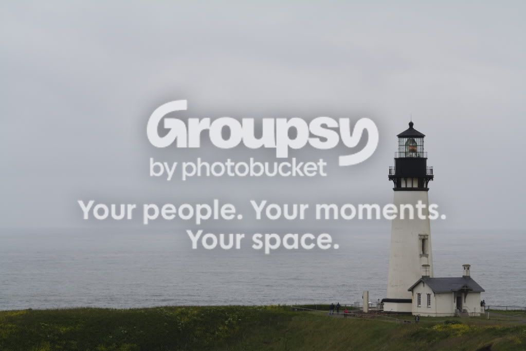
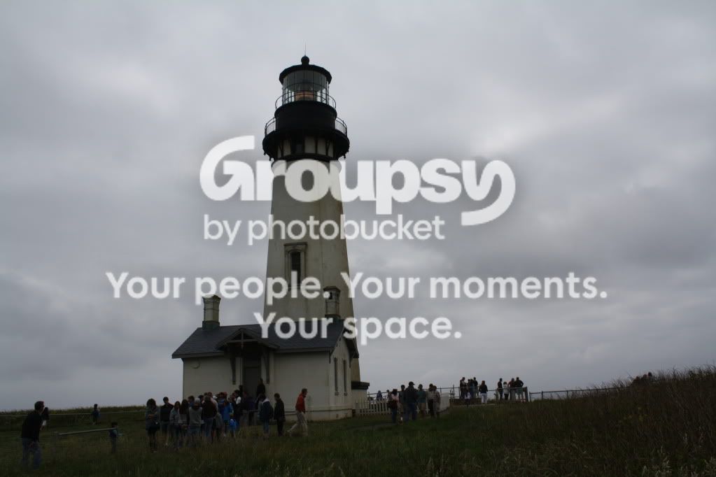
Yaqina Head Lighthouse

j28Photography

TPF Noob!
Joined
Aug 22, 2012
Messages
55
Reaction score
6
Location
Anchorage, Alaska
Can others edit my Photos
Photos OK to edit
[
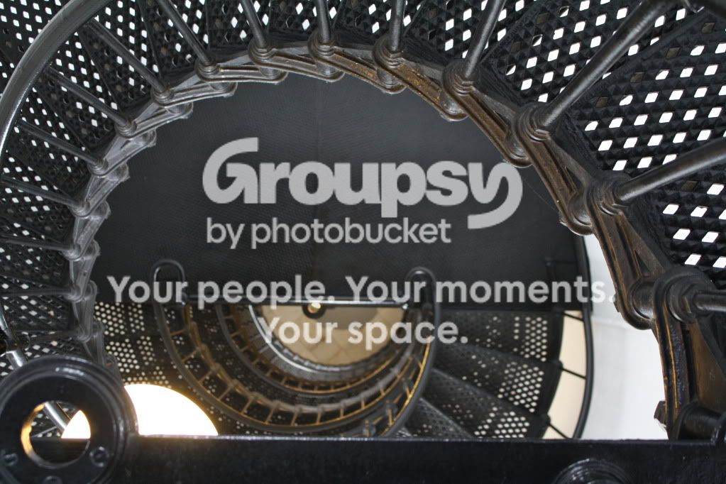
IMG_3218.jpg

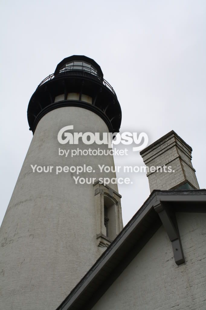
IMG_3205.jpg

IMG_3203.jpg

IMG_3192.jpg
 
Last one's a favourite, though I think it would be more emotional in black and white. There is very little colour in the first place, and so I'd convert it. #3 might have worked from a different angle, but it's not very interesting as it is now, IMO. Last one has a nice composition, I think, though maybe crop off some sky? Lots of empty space there that doesn't really play a part.

Anyway, I totally read that title wrongly.... :eyebrows:
 
You have a good subject but could use some life through color enhancement. #4 is my favorite but needs a pretty sunset/sunrise. :wink:
 
I agree with all of the above... it was a gloomy day when I went out. I'll try cropping some of that sky. Never noticed it until now.

Thanks guys.
 
A lens change would have helped the staircase photo; you weren't able to really capture the full spiral.

Or perhaps just zoom out, if you weren't already.
 
When I glanced over the title, I totally though it said something else that made me do a double take! Haha! But, I digress..

I think 2 and 4 are the best. I like two, because it has interesting lines, to me, anyway. I would have liked to see a bit more DOF so more of the upper levels were in focus. I also think it would have suited the photo a little more to have put that center dot more centered, vertically. I enjoy the horizontal line created in the lower third, but would like to see it straightened a bit. It kinda makes my head lean to the right..

Four is a strong one, too. I would +1 to most of the suggestions others had about it. Otherwise I like it!

 
Last image is the best composed, for my taste.... The emptiness is very meaningful here :D
 
When I glanced over the title, I totally though it said something else that made me do a double take! Haha! But, I digress..

I think 2 and 4 are the best. I like two, because it has interesting lines, to me, anyway. I would have liked to see a bit more DOF so more of the upper levels were in focus. I also think it would have suited the photo a little more to have put that center dot more centered, vertically. I enjoy the horizontal line created in the lower third, but would like to see it straightened a bit. It kinda makes my head lean to the right..

Four is a strong one, too. I would +1 to most of the suggestions others had about it. Otherwise I like it!

Work with me here as I'm just getting into photography... but whats "DOF"?
 

Create an account or login to comment

You must be a member in order to leave a comment

Create account

Create an account on our community. It's easy!

Log in

Already have an account? Log in here.

New Topics

Back
Top Bottom