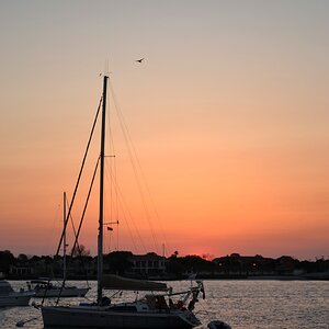
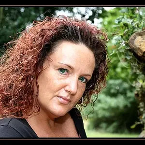
I clicked into this and looked at the picture and my first thought was....the color's look bland. This was weird since it seemed bright, so I saved the file and looked at the histogram and you could benefit from a simple levels adjustment. There's a red cast over the photo which is really taking away from the colors.
Unfortunately with your "not okay to edit" I can't post the corrected example, but it looks much better with the levels adjusted.
Edit: I just looked at your site and some amazing stuff on there. Anyway, from the looks of things, you'll know how to adjust your levels now that I pointed it out.




![[No title]](/data/xfmg/thumbnail/38/38261-db20f6f92ee8f0d4c5cf1536e308638b.jpg?1734172147)