FWIW, OP.
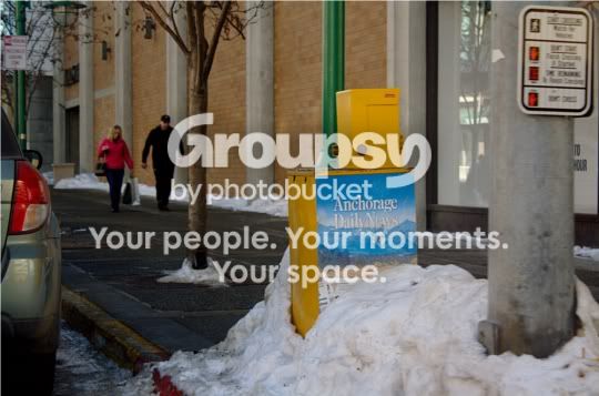
It's underexposed by about 1/3rd of a stop. The composition is poor IMO. There's a car on the left hand side of the frame that might as well be cropped out. The text "reads" funny because it's on the wrong side of the frame. The supplementary POI's in the photograph do not appear to be aesthetically pleasing to me, but I suppose beauty is in the eye of the shutter actuator or whatever. In all honesty, the sign on the stop light pole draws more weight than the newspaper stand that's in focus.








![[No title]](/data/xfmg/thumbnail/42/42458-8274869c9294d2f0655f80c8f0e6048c.jpg?1734176996)