Trever1t
Been spending a lot of time on here!
- Joined
- Dec 30, 2010
- Messages
- 9,331
- Reaction score
- 2,722
- Location
- San Jose, CA
- Website
- wsgphotography.com
- Can others edit my Photos
- Photos NOT OK to edit
So in this image I was very tempted to crop in tightly but doing so would lose the grandeur of that fireplace. What do you think about that? Any other thoughts?
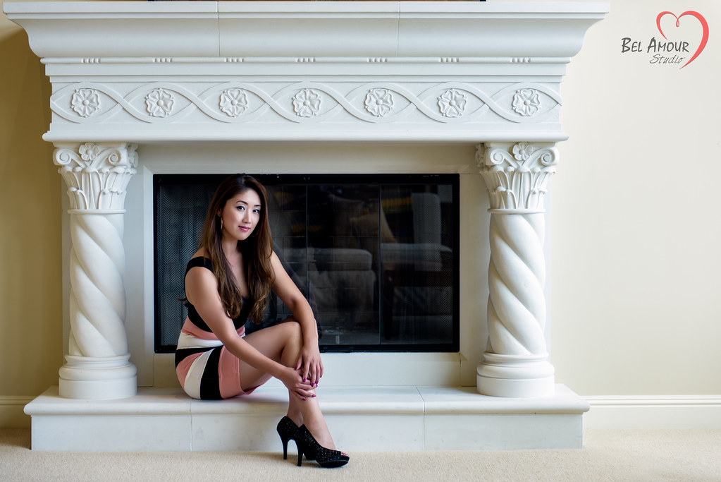
_POR1927-Edit by Bill Grayson, on Flickr
Tighter crop (5x7)
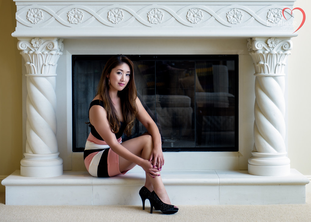
_POR1927-Edit-2 by Bill Grayson, on Flickr
_POR1927-Edit by Bill Grayson, on Flickr
Tighter crop (5x7)
_POR1927-Edit-2 by Bill Grayson, on Flickr
Last edited:

")
![[No title]](/data/xfmg/thumbnail/32/32698-38e2346942223e17b43fb958f66064c1.jpg?1619735601)

![[No title]](/data/xfmg/thumbnail/37/37606-3c9ffb5906173fa2aa489341967e1468.jpg?1619738148)
![[No title]](/data/xfmg/thumbnail/32/32699-3434a76363cb383404e00a3cd5ed5728.jpg?1619735601)