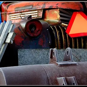
#1 is interesting. It is not bad, but could be composed better. Right now it is unbalanced -- everything is on the left side. The composition could have been balanced in a few different ways, but that is irrelevant now since the moment is gone. I appreciate the simplicity and the colors. #3 is also good, to a lesser extent. My eye focuses in the middle, at the man's bent arm and the vertical rail, and then my eye wanders toward the right side because that is where the man is looking, which is a natural viewer tendency.




![[No title]](/data/xfmg/thumbnail/32/32182-3ec35e12e238c681a086455c4586fbef.jpg?1734161047)




![[No title]](/data/xfmg/thumbnail/31/31050-824a861ee359cd274a794fc7b9ff8f7b.jpg?1734159158)