#1 - I really like - although at the same time their "outside" hands, resting on the bench feel funny to me. I don't know what else you could have done but a different pose on the hands?? Maybe holding pitchforks (just kidding!).
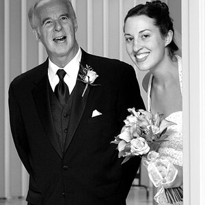
#2 - His head is cut off - cropping issue or is it uncropped? I may not have minded her left arm cut off a little - but the elbow is cut off on her right arm.
#1 has a wonderful appeal and is a delight!! It would be better however, with a bit less vignetting--the effect is a bit too strong, but I LOVE,LOVE,LOVE the pose and their expressions. Numbers 2 and 3 would have made outstanding verticals, and the horizontal chop-off of her arm and his head makes #2 lose a lot of the impact it might have had. You had an exquisite setting,and a stylishly-dressed and well-coiffed couple, but you amputated her elbow and his head and lost most of the impact of "them" by failing to turn the camera to vertical. I have pretty strong opinions on what constitutes good composition and what is aesthetically pleasing to people trained in the visual arts. I hate to be "that guy" that rips a poster's first post, but I will tell you this: I think you have a LOT of potential ability with a camera, but your posing does not follow thousands of years of accepted ways of showing people to their absolute best advantage. Your work could be absolutely fantastic with just a few,simple adjustments to your approach. Like for example: 50% Dutch tilt, 3 of 6. That's too often. That makes the photo about YOU, and your desire to tilt the camera, to try and ad dynamism to two people in the prime of their lives, looking as good as they can possibly look,after HOURS of preparation on their part. They do not need any Dutch tilt!
In #3..she is looking out of the frame, and even worse--she is "armless". Cropped off right at the elbows. She is standing upright, ie she is vertical, and she is leaning against a vertical column...and she is wearing a wrist corsage, has beautiful manicured nails, and a pretty dress. And so--you held the camera horizontally. And threw away the manicure. And threw away the wrist corsage. And broke the harmony of vertical,vertical,vertical by holding the camera in the horizontal capture mode. His un-buttoned jacket and long,bright yellow necktie is also an attention-stealer; with jacket closed, it would have had a different effect. This vertical subject inexplicably framed with a horizontal camera issue is really hurting 80 to 90 percent of new shooters who are not familiar with the language of visual communication.
What would have been better? Take two big steps to your left. Rotate camera. Thus including less white marble, and more "girl in her prom regalia." The vertical columns in between she and him would still be there. She would be shown more--her hands, her manicure, her lovely wrist corsage, and more of her dress, and more of her lovely, youthful figure. This is a portrait for the ages...for a lifetime...prom portraiture,engagement photos, wedding photos,senior photos. They are often displayed and viewed for many,many years. Small things, small errors or overlooked details become more visible over repeated viewings. Fundamental errors in judgment or composition are much more basic. When a person's pose is VERTICAL,and they are posed with strong vertical lines or objects (like massive vertical marble columns!) showing them with a vertical camera orientation STRENGTHENS the pose, and adds harmony. But holding the camera and hacking off arms, and feet, and bodies and NOT SHOWING critical parts of the human body creates a very compromised portrait that goes against centuries of visual communication ideas.
Again, I want to say--I think you show tremendous potential. You asked for C&C, and I have now spent maybe 15 minutes typing this out. Some people will obviously not like what I had to say, but I don't care what people have to say about me. I wrote this to help you,and others, to be able to understand why I so often talk about using vertical camera orientation on vertical subjects that will BENEFIT from the proper use of compositional principles and space, sound posing strategies, and so on.
Excellent processing and color on these. A bit less tilt on #6 would have improved the shot tremendously; that white empty floor space in the lower right hand corner is super-distracting, and his dark suit against the white marbkle background makes him,and the entire photo, appear to be falling over.
Thanks for posting these. Even as they are I love them all. Thanks also for inspiring Darrel to one of his tutorials, when Darrel speaks, many people listen and learn (me especially), not just the OP.
Looking forward to seeing more of your work. :thumbup:
not bad.. but yea, the tilt kills the last three for me. #2.. cutting his head off.. not good! The shadow behind her face in #3 is a bit harsh too. Decent other than that!
A great set of photos. When I clicked on the thread I was expecting something very different. I very pleasant surprise. The only small niggle I can see is I think the skin tone of the guy is a little too pink. Other than that, a great set which I am sure they will both treasure!
No 1 is my fav, I love the PP on this and the pose. I would not change a thing.


![[No title]](/data/xfmg/thumbnail/37/37129-2b15d9f6bc8d43c2c1247a6c591d14aa.jpg?1619737884)