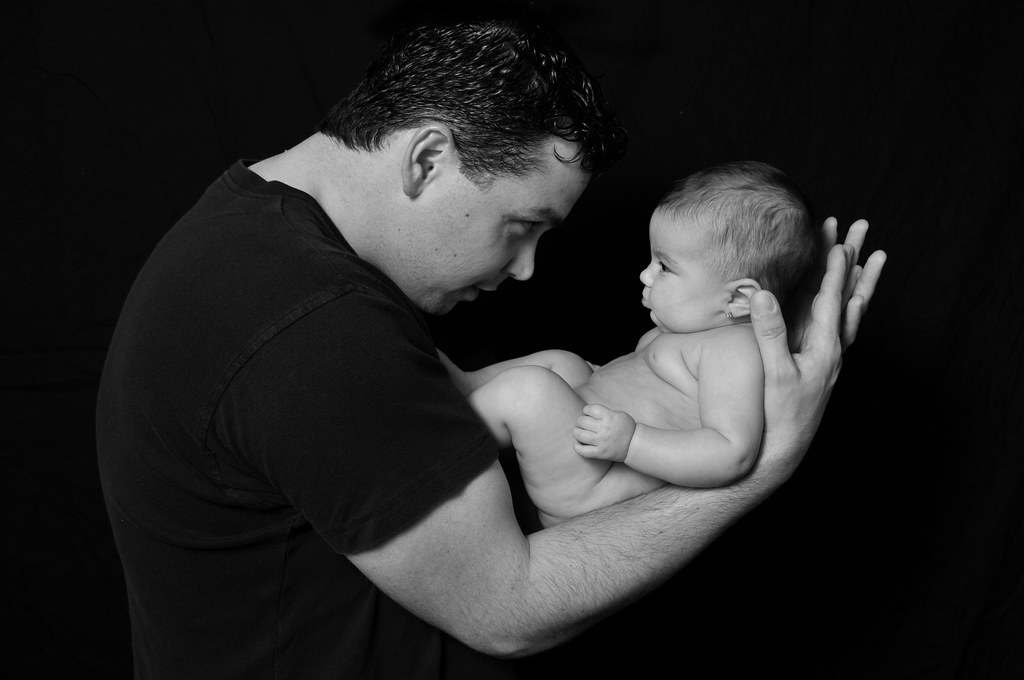
#1-
I like it! Cute overall. I would have preferred the Dad's hands to cup the baby's head gently...his fingers are a bit distracting like they are now-just my opinion of course. I still like the photo though.
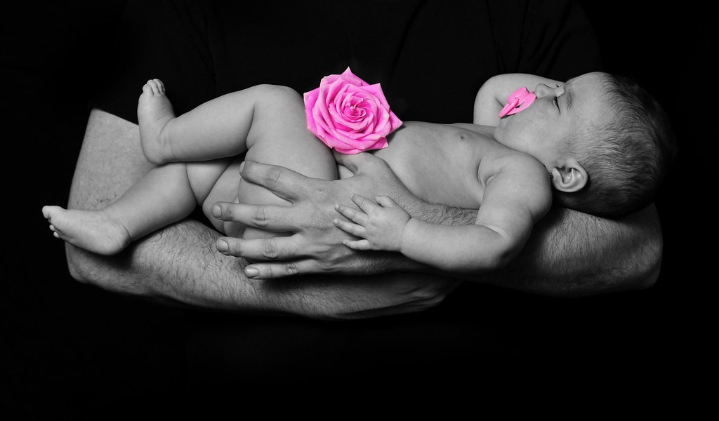
#2-
I really don't care for the edits. Especially the paci being pink. I'd love to see this in pure b&w (or maybe tinted vanilla, even?). Can you post it without the colored rose & paci? Or, if you want to color the rose, maybe not so saturated? A pale pink possibly.
#1 is very sweet.... I just wish dad's hands were cradling the baby's head softly instead of looking tense. I actually wish his whole stance was softer.
I don't care for selective coloring at all, so the second does nothing for me!
Although I do love the little hand against the big hand.
#1, any negative I would have has been covered. Now, I like the lighting, there is good separation from his black shirt and the black background. And, it is a nice B&W conversion.
#2 is a very sweet image. It is a good conversion too. On this one I like that his shirt disappears into the background it fits this shot. I understand why you did selective coloring (although 99% of the time I don't like it) the idea of the pink works to let it be known she is a girl. To me, as it is now the pacifier and the rose pull away your attention from the baby. I think it would be better if you desaturated the pink to a level that you hardly notice it, but you still see that it pink. It may or may not work, just an idea....
very nice... how old is the baby? She looks like she's maybe a month old?
The older the baby, the harder it is, I've learned that lol.
Try a freshly fed baby, very nice warm room (space heaters even. The baby doesn't care if you sweat) and recently rocked by mommy. Remember, their naked, your not, what's comfortable for you may not be comfortable for them.
the pose in #1 is awful... baby looks great... dad looks awkward. Not a fan of Dad's profile view (don't think it does much for him, perhaps if his face was posed a bit differently) but what hurts him in this is that he loses me because of some of the shadows in his face... in that position i'd work out a different lighting setup to fill some shadows, it may slim up his neck a little bit too. his fingers are annoying the crap out of me, they should hold the baby's head instead of looking like something is sticky on baby and he doesn't want to put his fingers on her. I think this picture would look much better if he had a protective bond feel over his child... right now it just looks like he's either about to drop the baby and/or trying to figure out what the heck is on her nose .
The 2nd one... I hate selective coloring but regardless of that, this picture would be WONDERFUL if it didn't have that fake rose and pacifier in it (they are distracting, even if they were black and white with the rest of the picture)... in a picture like this, you don't need props and certainly no pacis... if it was just simplistic with arms and naked baby it would have been a gorgeous shot b/c the baby's pose is great and everything looks natural and peaceful... the rose and pacifier mess it up
just my opinion though... you've got a good eye and they are great photos composition wise, just a few quirks in them that keep it from being awesome. keep praciticing!


![[No title]](/data/xfmg/thumbnail/30/30885-2764c7a15a288ed06f3903d3a2756832.jpg?1619734497)
![[No title]](/data/xfmg/thumbnail/30/30888-e7fd3f6ad2e0d85268f086de6d796459.jpg?1619734499)


![[No title]](/data/xfmg/thumbnail/38/38262-10a9668da9a2b36a92cddde57caf87bc.jpg?1619738547)
![[No title]](/data/xfmg/thumbnail/38/38263-ad5e4c9e677626ddb5b1e7cdf9ebe40e.jpg?1619738548)
![[No title]](/data/xfmg/thumbnail/30/30886-4d4f2b370f36c175a23901cc8689aea4.jpg?1619734498)