A couple for your C&C

Stamp

TPF Noob!
Joined
Dec 2, 2009
Messages
220
Reaction score
0
Location
Louisville, KY
Can others edit my Photos
Photos NOT OK to edit
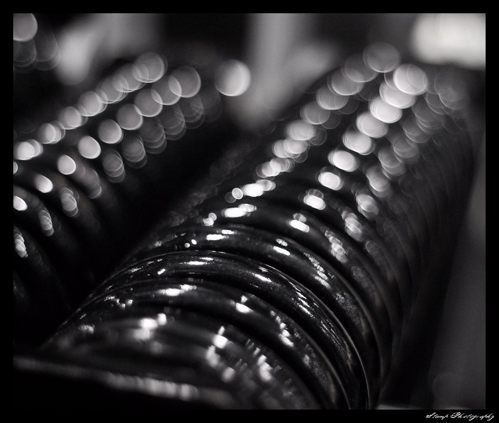
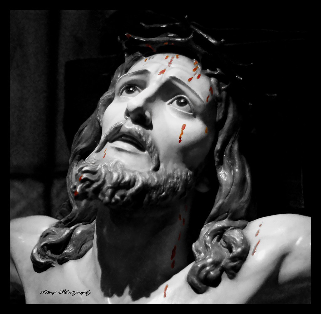
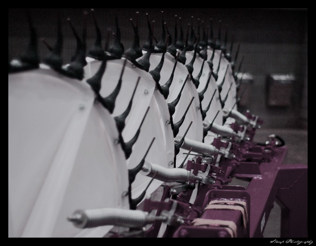
Here are a couple from a farm machinery show that was in Louisville a couple weeks ago... They don't tell much of a story, but sometimes it's difficult to find something in a show like that.... The third is a bust that was in a church during our newest daughter's baptism that I tried some selective coloring on. C&C like always is appreciated.


1.)
4402143233_1c4acc65ee_b.jpg


2.)
4402908612_f657f2e21a_b.jpg


3.)
4402145177_d87b91373a_b.jpg
 
farm machinery, what's this?
 
I generally like the first two images, but I've been in a shooting mood of late looking for such images...lines, shapes and such in everyday life.
1- Great lines here, really interesting subject. I'm not liking the background water fountains, and I'm unsure about the red part on the bottom. While getting closer in would of helped minimized the distractions that are currently taking from the main subject, I think it might have been hard to achieve the same look with less in the image.
But be mindful of backgrounds...use a wider aperture or telephoto lens to make the background blurrier. How would this look cropped and in black and white? I feel that BW really draws attention to shapes and lines and helps hide things that are less important. Red is a really strong colour that draws the eye, but if you still want to show the red hitch but not have as much attention to it, try it in BW.

2- Great image, I really like this one. The thing I'm iffy about is actually the part that is in focus. There are some great shapes in the bokeh and lights, and i find this appealing to my eye, and the part in focus is a bit harder on the eye.

3- Uh, I dont like this. I find the selective colouring not very well done and I see grey blood spots and red blood spots. The image looks a bit soft as well. Selective colouring is a tool used to draw the viewers eye to something of importance in the image... I find the blood isn't the important part of the image, but its the statue.
 
#2 is a great abstract. nice bokeh too.
first on is ok.

im with twinky on the last one.
 
Thanks for the feedback, guys... Good thoughts there, BT, I'll try it in B&W and see if that does the trick... It was difficult to manage the background at that type of inside show, and thats why I was on the fence about posting it, was because of the background... I shot these all with my 50mm 1.7, and didn't have my telephoto with me.... Thanks again for the C&C...
 
Which of these do you like? I really like the powerful red in it, so I lightened up the saturation and changed the hue a bit on the first one, and the second one is just plain B&W.

1.
4406505436_2f319b0bab_o.jpg


2.
4406505500_dffa03247e_o.jpg
 

Most reactions

Back
Top