
Lacey Anne
TPF Noob!
- Joined
- Mar 6, 2008
- Messages
- 709
- Reaction score
- 0
- Location
- WA state
- Website
- www.laceyanne.photoreflect.com
- Can others edit my Photos
- Photos OK to edit
Always welcome C&C! I know I cut off some limbs though.  I didn't have enough space. I'm working on fixing that. I'm particularly intrested on c&c for lighting and pp.
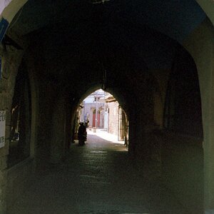
#1
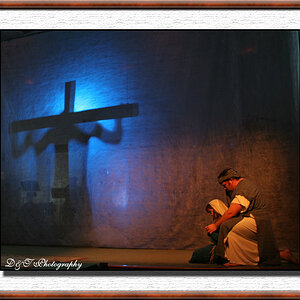
#2
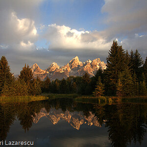
#3
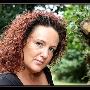
#4
#5
I didn't have enough space. I'm working on fixing that. I'm particularly intrested on c&c for lighting and pp. #1
#2
#3
#4
#5


![[No title]](/data/xfmg/thumbnail/39/39225-99d579cd498f8f152a288d7e8e7ad2a4.jpg?1619738926)